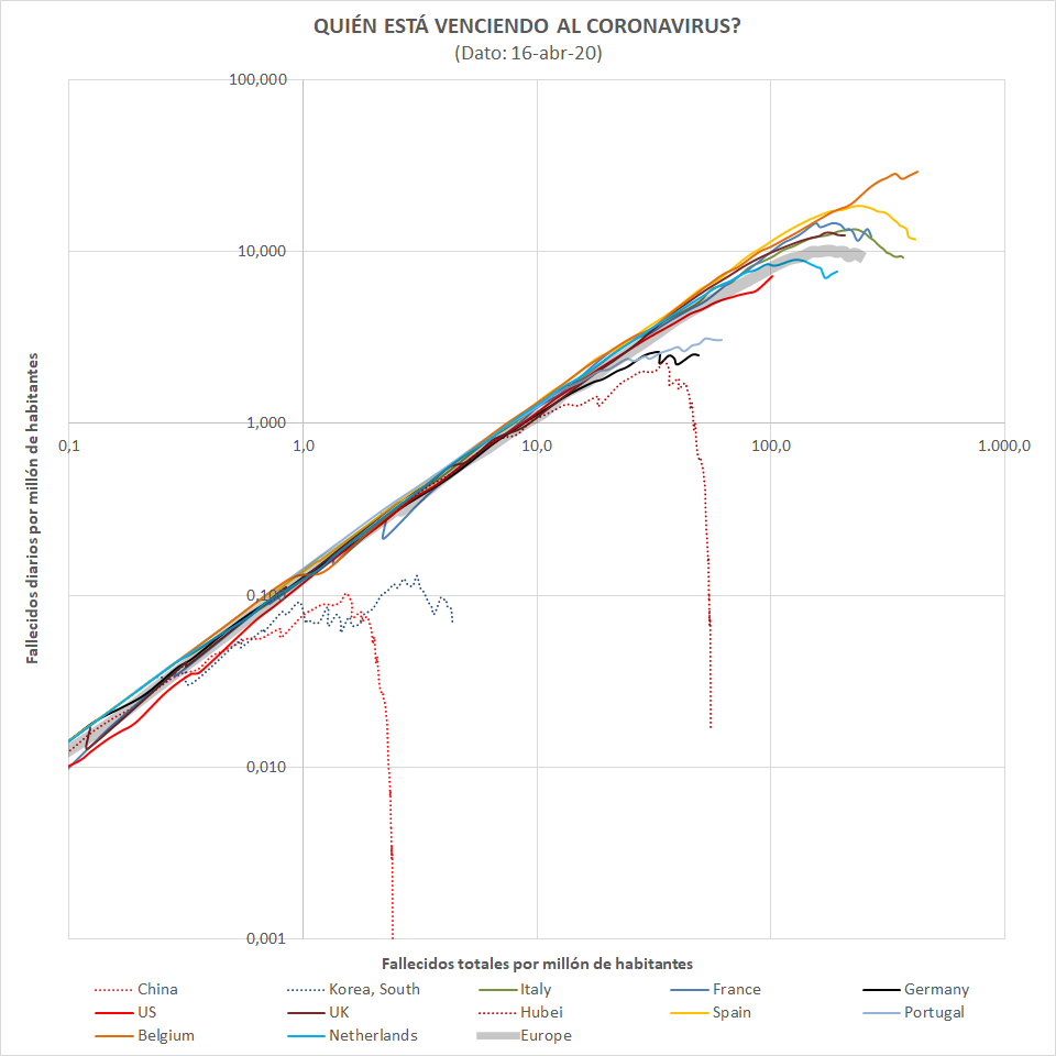
Update of the evolution of deaths plot.
Reminder (X-axis=Deaths per million inhabitants, Y-axis=Daily deaths per million inhabitants):
- Countries in the diagonal still don't control the disease.
- Countries bending down are already flattening the curve.
- The higher a country gets the more relative population have died.
All subject to the coronavirus deaths accounting criteria on each country.
- Belgium shows terrible relative numbers and trend.
- Spain, Italy and at some distance France, UK and the Netherlands, have quite high numbers but are controlling the disease
- Bad trend in the USA but still with low relative numbers (the disease arrived later)
- Very good figures and trend in Germany and Portugal
Regards
