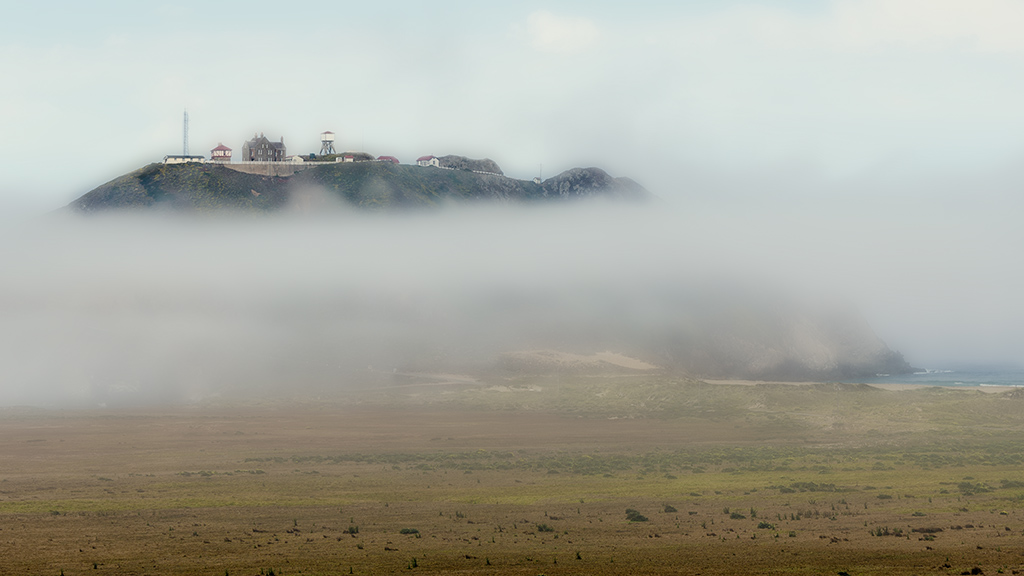
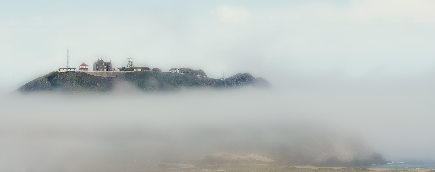
With Chris' permission I'm posting my suggestions originally sent to him in PM. I really love his image of Pt. Sur Light - but felt that removing the foreground, to get a more pleasing compositional emphasis on the facility, removed the reality of the "sense of place" one gets when there. The remoteness of the light facilities on top of that huge rock, jutting out from the coast on its peninsula is an important part of the image, IMO. To wit, I offered the following:
"What if you left the foreground in, but brought the tone of it down with a gradient so that it leads the eye out to the rock/fog/facility? I played with it and think that if you increased the exposure in the gradient by about 2/3 stop, brought the highlights down to zero, shadows to zero, and then negative clarity to the max, and sharpness down until it looks 'foggy' in the gradient to tie the foreground into your fog/clouds? I also would reduce the saturation in the gradient a bit, in order to keep the main color-focal-point at the top of the rock. I 'finished' by taking it into CS6 and doing a content-aware-scale of the foreground to compress it, yet leave it with a sense of 'out-there-ness.'
Hope you don't mind, but I took the liberty of doing an example of what I'm talking about:
Your original post:
Your final crop in the post:
And my adjustments to (hopefully) keep the best of both worlds:

. . . end of quote from PM."
Chris liked it. I think this is a perfect-case image for effective use of content aware scale.
Rand
