Pages: [1] 2   Go Down

Author Topic: Custom Camera Profiling: A Look at the QPcard 203 book  (Read 29797 times)

samueljohnchia

  • Sr. Member
  • ****
  • Offline Offline
  • Posts: 498
Custom Camera Profiling: A Look at the QPcard 203 book
« on: February 15, 2013, 02:14:33 am »

Introduction
My own exploration into the world of custom camera profiling led me to discover the QPcard 203 book. This is an updated version to the QPcard 202, which is more prone to surface reflections because of less matte color patches. The free software, QPcalibration, that builds the custom camera profiles, automatically recognizes the cards and uses the respective set of reference values for its internal calculations. Very cool. No fussing about with controls points like in the Adobe DNG Profile Editor (DNG PE). The instructions on QP's website are straight forward and easy to follow.

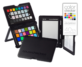
At the moment I have as well two mini ColorCheckers from my i1 Pro kits, and I briefly owned a ColorChecker Passport too. I have used the ColorCheckers very successfully for profiling my camera for naturally lit (daylight) photos. I am pleased with the results. However, I'm not going to let the QP pass by me, especially if there was a possibility of better results!

This press release by QP, claims that their product is the better (and more economical) alternative to the X-rite ColorChecker Passport. While it does mention that the X-rite software only corrects for 6 hues and the QP card has 32 corrections for hue and 4 for saturation, the free DNG PE's profiles contains 90 corrections for hues, and 25 corrections for saturation. For dual illuminant profiles there are two such tables, and they are linearly interpolated for white balance temperature settings in ACR/Lightroom between 2850 K and 6500 K. For various reasons I do not recommend the X-rite Passport software, but the DNG PE. This is what I used for my comparisons. The corrections I refer to are found in the HueSatDelta tables of the DNG camera profiles, which can be decompiled using Sandy's dcpTool.

So the QPcard has 35 color patches whist the ColorChecker has but 24, the former with seven neutrals, and the latter with 6. QP claims: "All the patches, even though they may look similar on our cards use slightly different base pigments. The result is that our products use a higher number of spectrally unique hues than any other comparable reference card." Will a greater number of "better formulated" color patches but a reduced resolution of the profile's LUT be able to produce a better result than the ColorChecker + DNG PE approach? And there are also other issues that will affect the final profile quality. QP designed the 203 with a white background so that the software can automatically correct for unevenly lit targets (within limits), and it also corrects somewhat for lens falloff at the edges. Very cool again. But I am not sure if the white backing will result in strong enough veiling flare and obscure the darkest gray patch slightly.

Another thing to note is the QPcalibration does not support dual illuminant profiles, because according to the same press release, "a dual illuminant profile will only correct accurately at the two points where you profiled, all intermediate color temperatures
will get the wrong correction
". Tim Lookingbill proved that this was not the case when the two illuminants are spectrally smooth, like tungsten and daylight. One will get achieve a profile that is generally usable across a wider range of correlated color temperatures that way, with more accurate warm colors. One will have to build separate profiles for daylight and tungsten when doing things the QP way.

First Impressions
Firstly, thanks are in order. The efficient folks at QP shipped my card from Sweden to Singapore just 5 working days after my order. This is excellent. The card is simply but properly and durably packaged, with no exterior damage to the card (or the packaging for that matter) during shipment.

Then I discovered some unhappy things. Firstly, there is a substance on the front cover of the card, which is slightly sticky to the touch. Perhaps it is some glue residue from gluing the paper/card components of the book together. This is quite disappointing workmanship.

When I opened the booklet, the unevenness of the surface of the large gray patch for white balancing was immediately obvious. From the large bump where the tying ribbon is attached, to small dimples everywhere over the surface, it is very irregular. The card must be carefully lit with diffused lighting otherwise clicking on various spots in the gray patch with ACR/Lightroom's White Balance Tool results in different temperature and tint settings.


Moreover, the surface of the gray patch is marred with long grazing scratches. I don't know what caused it, but they remind me of similar scratches on inkjet prints that are handled poorly. It should not be there on a new product! Also the cutting of the paper frame is badly done with creases and the edges are frayed. There is also some glue residue.

Unfortunately, the color patches are not in good condition either. Firstly, the one of the cream colored patches has a spot of aqua paint, possibly a splash from the adjacent patch during (I presume) the silk screen printing of the patches. Also, there are two other splash spots of paint, one of the cream patch, and another of the aqua patch on the white paper card.


Other patches have dust or flecks of dirt embedded in the patches. Blowing it away with a lens blower did not help - they are definitely stuck on the surface. I know that the QPcalibration software reads 6400 points off the photographed target and calculates from 3200 points, throwing away half of the outliers, but I don't think the patches themselves should be in such poor condition when new.

What is even more disturbing is how the patches are all slightly reflective. This image, taken with grazing light to the card, shows the problem at its worst. Scratches on the magenta patch, as well as across the most saturated red and sunset orange patch are also obvious. Note the surface sparkle. I don't know what is causing this surface sparkle (its more sparkly than a sheen), but it definitely is not a smooth matte surface like the ColorCheckers I'm used to. It is almost as though the patches were scuffed after the paint had dried, perhaps from stacking the cards with no protecting interleaving sheets so the back of one card rubs the patches of another, or perhaps from doing that before the paint had fully dried.


I only have experience with one QPcard at the moment, and while certainly I cannot categorically say that all the cards are flawed like mine, I have never had any issues with ColorCheckers, (nor have I ever heard of such problems) and I am quite disappointed that this card is in such poor condition fresh out. If others out there have QP 203s too, please let me know about the condition you received them in.

The Card in Use
Another issue that bugs me is that the QPcard 203 book is basically a cardboard that is folded in the middle. It therefore has "fold memory" and cannot be easily opened flat like the Passport. The passport to me wins because of its ability to stand on its own

and be opened to multiple angles - past 180 degrees - which is an advantage when placed standing (like an upside down V shape) on its own in a reference scene to be profiled. The QP203 book can only be made to stand vertically on its own, (it can certainly be held up at other angles with other props, but that is a nuisance) which is not ideal for most lighting situations unless one can get an assistant to hold the card at a suitable angle. Ideally, one wants the illumination to hit the target at about 45 degrees incident and the camera to be pointing directly at the card.

If the QP is standing on its own, the chart cannot be opened flat, and there is a possibility that the white paper backing and the color patches will reflect onto the gray patch and throw of white balancing with it (the gray patch has produced varying results for me thus far), or light may be thrown from the gray patch on to the colors. By the way, the gray patch of the QP is not as spectrally neutral as the Passport, as measured by Robin Myers over 2 charts. His review of the Passport also points out one additional advantage, that because the Passport's white balancing gray patch is much lighter, one can get a better exposure (greater signal to noise) especially in dimmer lighting.


Profile Building Settings in QPcalibration
The settings in QPcalibration are few, but important. There are three of them which can affect the resulting profile - "Curve Set", "Smoothing" and "Gamut Matching".


"Smoothing" makes almost no difference for daylight profiles. QP recommends it in the event one experiences posterization effects when photographing under unusual illumination. It is off by default, and I used that setting.

"Curve Set" by default is set to normal. At normal, it is identical to the 96 point curve that is the base tone curve in the DNG PE, except for the lowest 18 points where it is a bit lighter. I tried the high and low options but it only decreased the accuracy of the profile.

"Gamut Matching" comes into play depending on what one chooses as their output working space in ACR/Lightroom. Since I use ProPhoto RGB, it is set to large. Medium and Small are for Adobe RGB and sRGB respectively.

Profiling Results
Some general observations. QP's profiles are generally slightly lighter in tone overall than the DNG PE's profiles. Also it tends towards a more green-blue cast, but that is correctable using the white balance sliders in ACR/Lightroom. I preferred the grayscale rendition of the DNG PE, which was slightly more neutral, even after proper white balancing for the differing profiles.

For colors, the QP has a tendency to darker reds and darker blues, while foilage greens are consistently lighter when compared to the DNG PE's profiles. The QP also tends to make yellows a bit too saturated and neon-like.

Here is a tif file with the shot of the QPcard and ColorChecker, with each profile on a separate layer, in ProPhoto RGB. I also included the reference patches for comparison. I found the reference values from QP's own website to be quite a bit less accurate than Robin Myer's measurements, which I used for these reference patches.

Something to note is the rather harsh transitions from reds to greens for the QP profile, precisely because of the tendency to lighten greens and darken reds. This example shows the issue to a moderate degree.


Another user on dpreview has a similar albeit more severe issue from purples to greens: http://forums.dpreview.com/forums/thread/3227175?page=2#forum-post-41900656

Conclusion
After making a number of comparisons, I find that the QP is sometimes more accurate for some colors than the ColorChecker, usually in the lighter colors. This could be due to the presence of light color patches on the QPcard that is not found on the ColorChecker. However, I found the ColorChecker to be overall more accurate than the QP for the majority of daylight photos. The rendition of blue skies, foilage and wild flowers was not just more accurate, but also more pleasing. I also had trouble totally eliminating the slight greenish cast that is present in the QP profile. Although the QP is marketed as a more economical product, at this point I think the Passport ColorChecker is better made, produces better results more often (with the DNG Profile Editor, not the X-rite software!), and is better value.

The world of camera profiling is fraught with controversy, probably more so than display or printer profiling, since final rendering of tone and color is not only influenced by settings in a photographer's raw converter of choice, but also because rendering of color is very much personal. As Eric Chan has mentioned before, “Due to technical limitations, camera profiles are necessarily imperfect, and hence each software must make tradeoffs in terms of which color characteristics it is optimizing for. Since different software programs tend to optimize for different things, it is natural that the resulting profiles will also behave somewhat differently.

Tim Parkin, who conducted the much heralded IQ180 verses 8x10" film re-tests, recently wrote about camera color too. This article here, (needs paid subscription but you can see most of the best parts), expounds on the issue of sensor metamerism, and hints at variable imperfect band pass filters on the color filter of the Bayer array, resulting in poorer or better color accuracy for different sensors. This follow up article (needs free subscription to view), explores similar issues further, and also discusses the photographer's preference. Whether or not the final result is "accurate" is a tricky proposition, and while the subsequent paragraphs will reveal what I prefer, your own results with your own cameras, choice of raw software, how it renders colors and tones and your own preferences will determine your preferred approach.

I will try to post more comparisons over the next couple of days.
« Last Edit: February 18, 2013, 09:52:34 pm by samueljohnchia »
Logged

Vladimirovich

  • Sr. Member
  • ****
  • Offline Offline
  • Posts: 1311
Re: Custom Camera Profiling: A Look at the QPcard 203 book
« Reply #1 on: February 15, 2013, 11:31:46 am »

put both targets in one shot,

build profile from QP, build profile from XRite

convert using QP, convert using XRite

calculate dE for XRite patches w/ QP profile
calculate dE for QP patches w/ XRite profile

which one will do better ?
Logged

mac_paolo

  • Sr. Member
  • ****
  • Offline Offline
  • Posts: 431
Re: Custom Camera Profiling: A Look at the QPcard 203 book
« Reply #2 on: February 15, 2013, 12:28:18 pm »

I recently bought the very same card.

I agree with Samuel. Quality is quite good but manufacturing has some issues.
My patches don't have any drop of neighbor colors, yet I found a very long mark which runs through several patches.

Qpcard support told me it shouldn't be an issue performance wise.

It's clear that Xrite CC24 may be less precise but better built. Overall it feels somewhat homemade.
It's not a bring everywhere product like the Xrite CC Passport.
Logged

samueljohnchia

  • Sr. Member
  • ****
  • Offline Offline
  • Posts: 498
Re: Custom Camera Profiling: A Look at the QPcard 203 book
« Reply #3 on: February 15, 2013, 07:24:18 pm »

put both targets in one shot,

build profile from QP, build profile from XRite

convert using QP, convert using XRite

calculate dE for XRite patches w/ QP profile
calculate dE for QP patches w/ XRite profile

which one will do better ?

I already did that and posted a link to a tiff file, layers, in ProPhoto RGB.

For what it's worth, it was made using a rather badly damaged QPcard 203 book with color patches in poor condition. I measured the patches with an i 1 Pro and they were reasonable close to the reference  values that I have - somewhere between QP's own references and Robin Myer's. So that is ok. But lighting the target well so that the patches don't show their scuffed marks is hard. I think I got it pretty much spot on with that one. Unfortunately I think I didn't have ideal illumination - it was a cloudy sort of day and I shot it in the park and there is an overall green cast, probably from some trees nearby. I will want to redo things when I get a new QP and proper sunshine in the open.

Also, I did not bother to calculate the dE for the patches. If you wish to do so you may. I may try that when I have a better comparison, but again the QPcard profile is just inaccurate enough that it's not funny. Interestingly it does not have a light blue sky patch, and for some reason that results in a too dark rendition of blues. Same for reds. Greens are too light. There is oversaturation of the reds, and when I have blue shadows, the blue channel often gets clipped when the QP profile is used. A check of the raw histogram indicates that the blue channel was not originally clipped for those captures. Yellows also get pushed towards green and renders with a neon-like hue. Not so for the ColorChecker. This is true even for fluorescent light tests that I did.  The relationship of the lightness of each color hue is really out of proportion and it results in distorted rendering of images from my camera. The ColorChecker does much better in this regard.

By the way all this was with Adobe Camera Raw in process version 2010 with all the settings zeroed out, tone curve linear (very important as that distorts hue and saturatio,n different over ranges of tones, affecting interpretation of the profile), ProPhoto RGB and 16 bits. Proper white balancing after applying the respective profiles. Lots of folks doing comparisons with QP and the CC forget to do this, or process out into Adobe RGB, which will not reveal how the profiles handle colors well outside the gamut of the target itself - that aspect has to be extrapolated and is very much dependent on the genius of the algorithms in the profile building software. The X-rite Passport software fails at that.
« Last Edit: February 15, 2013, 07:28:10 pm by samueljohnchia »
Logged

samueljohnchia

  • Sr. Member
  • ****
  • Offline Offline
  • Posts: 498
Re: Custom Camera Profiling: A Look at the QPcard 203 book
« Reply #4 on: February 15, 2013, 07:37:52 pm »

I recently bought the very same card.

I agree with Samuel. Quality is quite good but manufacturing has some issues.
My patches don't have any drop of neighbor colors, yet I found a very long mark which runs through several patches.

Qpcard support told me it shouldn't be an issue performance wise.

It's clear that Xrite CC24 may be less precise but better built. Overall it feels somewhat homemade.
It's not a bring everywhere product like the Xrite CC Passport.

I just received an email from QP that they would be sending me a replacement. While I am grateful for that, I am saddened to hear that they told you it will not be an issue. The color patches have to be properly lit for the scratches not to appear in the final shot, (even then they may still be visible, like in my case) and while the software takes enough readings to ignore the outliers, it is no excuse that the patches should look like that. No one wants to buy a brand new car with the scratch on the paint work, although yes, "it shouldn't be an issue performance wise". I'm not so sure about color patches on a color target though. It certainly has been an issue performance wise for me. The gray patch for WB is unreliable as it is in my current damaged card.

I guess most folks here have the Passport so it should be okay. The Passport's gray patch for WB is a beautiful thing.
Logged

Vladimirovich

  • Sr. Member
  • ****
  • Offline Offline
  • Posts: 1311
Re: Custom Camera Profiling: A Look at the QPcard 203 book
« Reply #5 on: February 15, 2013, 08:29:55 pm »

I already did that and posted a link to a tiff file, layers, in ProPhoto RGB.

can you please share a raw file with both targets shoot together that was used to make both dcp profiles and create the abovementioned .tiff... if you don't mind.
Logged

samueljohnchia

  • Sr. Member
  • ****
  • Offline Offline
  • Posts: 498
Re: Custom Camera Profiling: A Look at the QPcard 203 book
« Reply #6 on: February 15, 2013, 09:19:34 pm »

can you please share a raw file with both targets shoot together that was used to make both dcp profiles and create the abovementioned .tiff... if you don't mind.

Here it is.

Although I doubt it is going to be an arguably fair comparison, since the lighting was a bit off and the QP is not in ideal condition. Also, you don't have my camera to see how it fares for other natural light photos. The targets react differently under direct sunshine, cloudy diffused sunshine, sunrise/senset warm light and cold blue pre-dawn light, the latter's SPD sometimes dipping in the green wavelengths.

Logged

Rhossydd

  • Sr. Member
  • ****
  • Offline Offline
  • Posts: 3369
    • http://www.paulholman.com
Re: Custom Camera Profiling: A Look at the QPcard 203 book
« Reply #7 on: February 16, 2013, 01:16:53 pm »

I bought my QP 203 'book' in March last year. Whilst it's not exactly precision manufactured like the Passport, I haven't suffered the product quality issues you're describing.

I've found the profiles it's built to be very good.
I didn't like the Passport profiles, they all seemed too over saturated and contrasty.

As others have said, at this level it's starting to become a question of taste, rather than trying to deliver some sort of perfect "accuracy" when using DNG camera profiles.

I prefer a QP generated profile with normal contrast and profile smoothing with large gamut matching, YMMV.
Logged

samueljohnchia

  • Sr. Member
  • ****
  • Offline Offline
  • Posts: 498
Re: Custom Camera Profiling: A Look at the QPcard 203 book
« Reply #8 on: February 16, 2013, 08:00:57 pm »


I didn't like the Passport profiles, they all seemed too over saturated and contrasty.

As others have said, at this level it's starting to become a question of taste, rather than trying to deliver some sort of perfect "accuracy" when using DNG camera profiles.

I prefer a QP generated profile with normal contrast and profile smoothing with large gamut matching, YMMV.

I also generated the QP profile with normal contrast and large gamut matching. Turning on smoothing did almost nothing (8 bit channel readouts are not precise enough to pick out the difference) to the resulting profile for daylight. Definitely did not make it smoother or prevent the transition issue I mentioned earlier.

Did you use the Passport with the X-rite software or the Adobe DNG PE? I remember the X-rite software gives too saturated and contrasty profiles as you mentioned, but I cannot compare that at the moment as I don't have my passport anymore. I don't have saturation issues with my ColorChecker and the DNG PE.

Take a look at this tif file. It is in ProPhoto RGB, please look at it in a color managed application. The differences are more subtle on an sRGB display as some colors fall outside it. For some colors, the QP actually results in a more saturated albeit darker rendition of color, opposite to what you said. But this is for reds, and for greens the converse is true. I have seen this flower very often in varying lighting conditions and I am quite sure that the QP is not doing the magentas - reds right.
Logged

Rhossydd

  • Sr. Member
  • ****
  • Offline Offline
  • Posts: 3369
    • http://www.paulholman.com
Re: Custom Camera Profiling: A Look at the QPcard 203 book
« Reply #9 on: February 17, 2013, 03:56:21 am »

Did you use the Passport with the X-rite software or the Adobe DNG PE?
I've tried both packages with various CC24s, not the physical Passport target. I found DNG PE to deliver more pleasing results than the Xrite Passport software, but the QP ones were subtly better.
From what I've read there's some variance within the manufacture of CC24 targets and I can see that on measurements of different examples here, so maybe it's not worth getting too concerned with tiny differences anyway.
Logged

mac_paolo

  • Sr. Member
  • ****
  • Offline Offline
  • Posts: 431
Re: Custom Camera Profiling: A Look at the QPcard 203 book
« Reply #10 on: February 18, 2013, 07:18:49 am »

Just tried to create six other profiles for my DSC-RX100.
Everything worked flawlessly under Qpcalibration software, but no DNG profile appeared under Lightroom after restarting it.

Can't understand why.  ???
Logged

samueljohnchia

  • Sr. Member
  • ****
  • Offline Offline
  • Posts: 498
Re: Custom Camera Profiling: A Look at the QPcard 203 book
« Reply #11 on: February 18, 2013, 07:33:00 am »

Just tried to create six other profiles for my DSC-RX100.
Everything worked flawlessly under Qpcalibration software, but no DNG profile appeared under Lightroom after restarting it.

Can't understand why.  ???

Have you seen this thread on the same issue?
Logged

mac_paolo

  • Sr. Member
  • ****
  • Offline Offline
  • Posts: 431
Re: Custom Camera Profiling: A Look at the QPcard 203 book
« Reply #12 on: February 18, 2013, 07:35:58 am »

Have you seen this thread on the same issue?
I'll have to read it carefully, but my camera is definitely supported.
I created several other profiles in the last weeks and they all correctly appear under Lightroom.
So maybe that's not the case.
Logged

Ernst Dinkla

  • Sr. Member
  • ****
  • Offline Offline
  • Posts: 4005
Re: Custom Camera Profiling: A Look at the QPcard 203 book
« Reply #13 on: February 18, 2013, 10:28:36 am »


Also, I did not bother to calculate the dE for the patches. If you wish to do so you may. I may try that when I have a better comparison, but again the QPcard profile is just inaccurate enough that it's not funny. Interestingly it does not have a light blue sky patch, and for some reason that results in a too dark rendition of blues. Same for reds. Greens are too light. There is oversaturation of the reds, and when I have blue shadows, the blue channel often gets clipped when the QP profile is used. A check of the raw histogram indicates that the blue channel was not originally clipped for those captures. Yellows also get pushed towards green and renders with a neon-like hue. Not so for the ColorChecker. This is true even for fluorescent light tests that I did.  The relationship of the lightness of each color hue is really out of proportion and it results in distorted rendering of images from my camera. The ColorChecker does much better in this regard.


For color rendering of landscapes, skies, foliage, flowers, insects, fishes, I would not rely much on cards like that. More chance with artificially colored subjects: cars, houses and even better furniture, paintings as originals in the studio with controlled light that is used both for creating the profile and the photo shoots. Pigment source has to have some relation to the pigments used in the subjects, color created in the subjects has to relate to the way color is made in the cards. Light preferably with a continuous spectrum. I have seen the QP card described here in that context and at that time there were positive reports.

--
Met vriendelijke groet, Ernst

http://www.pigment-print.com/spectralplots/spectrumviz_1.htm
December 2012, 500+ inkjet media white spectral plots.


Logged

samueljohnchia

  • Sr. Member
  • ****
  • Offline Offline
  • Posts: 498
Re: Custom Camera Profiling: A Look at the QPcard 203 book
« Reply #14 on: February 18, 2013, 10:59:41 am »

For color rendering of landscapes, skies, foliage, flowers, insects, fishes, I would not rely much on cards like that.
Ernst, what would you rely on then?

Quote
Light preferably with a continuous spectrum.
Actually, a developer at QP told me that a greater advantage to the QP comes when profiling for unusual lighting with spiky SPDs, like florescents/LEDs, as the ColorChecker is already excellent for daylight use. I was actually recommended to stick with that since I already owned one, if I only needed daylight profiles. But the offer came and I just had to know what the differences were for my workflow and setup.

Quote
I have seen the QP card described here in that context and at that time there were positive reports.
Honestly, if I had a Passport and used the X-rite software only and then used a QP, I would have said the QP blows the ColorChecker out of the water. I just downloaded the X-rite software and tried it again with the mini ColorChecker I shoot with, and yeah, its pretty bad. But then there is the DNG PE and I am simply more pleased with its accuracy, and subjectively also the way it renders color. Also if I process into sRGB/Adobe RGB I would also prefer the QP over the CC, because of its propriety gamut compressing LUT, applied after all the processing steps in ACR, before conversion to output space. The DNG PE+CC approach would result in clipped colors.

Likewise if I was a studio photographer and I only had the QP and no ColorChecker, I would honestly be astounded with its quality - and wonder how I lived through the dark ages of generic camera profiles. That's how I felt when I built my first successful custom camera profile. It's all quite relative.

I did a test under fluorescent lighting, and while the QP was more accurate in some colors and tones, the ColorChecker won for others. Overall, I rated the CC better again because the QP rendered the scene too light and generally speaking the CC approach was more "accurate" overall, or perhaps was easier for me to render the scene to match the original. I'm sure others will disagree or agree depending on a variety of factors.


Again, something very troublesome in the midst of all this is if one is evaluating the performance of a profile applied with edits applied in ACR/Lightroom, it is hard to argue for "accuracy". Editing of any sort will throw off the profile to some degree. For instance, changing the tone curve would increase contrast and saturation where the curve has a gradient of more than 1, and reduces contrast and saturation where the curve is less than one, with some minor hue shifts either way. I use curves in all of my image edits (I really hope that a luminosity and chroma curve would come into a future version of ACR!) - there is no way a CC photo will look like the synthetic reference thereafter. But I also want to evaluate the QP against the CC together with edits (I'm not reproducing artwork), and I want something that looks good, and reasonably close to what I saw/felt/want from the image. The CC is just easier for me to get to the look I'm after.
Logged

Ernst Dinkla

  • Sr. Member
  • ****
  • Offline Offline
  • Posts: 4005
Re: Custom Camera Profiling: A Look at the QPcard 203 book
« Reply #15 on: February 21, 2013, 07:18:07 am »

>>Ernst, what would you rely on then?<<

In landscape photography etc; the camera manufacturer's estimations of sensor responses + a Babelcolor improved PTFE grey-white tablet or similar white tablet gadgets that include black traps. For Cityscapes the same + the Color Checker Passport, though one wonders what light reflected from walls do in that case.
http://www.babelcolor.com/main_level/White_Target.htm

For me me as an amateur, some stacked plumbers's Teflon tape discs used as a white tablet if I approached it that serious.

For art reproductions; continuous spectral light around 5000K, the Babelcolor tablet, a Color Checker card. That is what I see the photographer do that does that work for me. Or improved cards with patches spectrally measured that suit the original, oil paint sample books, watercolor sample books. For Cruse scanners there is some work done like that. It works with a dedicated fluorescent light source though.

If the Cruse had two different fluorescent lights, two scan runs with one lamp each and the appropriate algorithms to discriminate what the metamerism effect then tells about the original color areas, it could be more selective. What is done in the cheap HP G4050-4010 desktop scanners. Poorman's multi-spectral scanning. Does not do a better job on the CMY dyes used in photography where all desktop scanners are calibrated on but does a better job on for example a reflective original painted with acrylics. See third PDF at this page:
http://www.image-engineering.de/index.php?option=com_content&view=article&id=57&Itemid=91
That is making use of "metamerism" metameric failure to nail colors.

Your approach is more or less the opposite, you think the metameric match of two colors in one light source to your eyes, the green patch of the Color Checker card and foliage green, should be equally matched to the camera in one light source if you calibrated the camera with the CC card in that light. It does not have to be like that though due to the different ways a green color is created in nature and due to a difference between your eyes and the sensor responses. It would be improved if you had a Color Checker card that is made of foliage itself, stone samples, bark cuts and if possible a sample that recreated what makes the sky blue. Not an easy road if we count all the optical effects:
http://en.wikipedia.org/wiki/Optical_phenomenon

--
Met vriendelijke groet, Ernst

http://www.pigment-print.com/spectralplots/spectrumviz_1.htm
December 2012, 500+ inkjet media white spectral plots.
« Last Edit: February 21, 2013, 07:23:39 am by Ernst Dinkla »
Logged

samueljohnchia

  • Sr. Member
  • ****
  • Offline Offline
  • Posts: 498
Re: Custom Camera Profiling: A Look at the QPcard 203 book
« Reply #16 on: February 21, 2013, 10:29:19 am »

In landscape photography etc; the camera manufacturer's estimations of sensor responses

Ernst, I use Adobe Camera Raw as my default raw converter, not Canon DPP for my 5D Mark II. Adobe does not use the camera manufacturer's estimations of sensor responses but measures their own. Despite their exotic hardware and software I find that their rendering of color is both quantifiably less accurate, and also visually than custom profiles that I make for my camera.

Yes, I want to expect that a metameric mismatch (I referred to this as color relationships) of two colored objects I see under daylight to be reproduced as accurately by the camera+raw converter as possible, unless metamerism issues lie with the sensor itself, not being able to discriminate between the two colored objects. I agree that the limited material of a small patch target is never going to be able to describe a broad range of natural and artificial surfaces, matter and non-matter substances. What other hope can individuals like me have to approach an increasingly elusive ideal color rendering of my digital images?

Are custom profiles a waste of time, money and effort? Can I not hope to get better results than the generic offerings from Adobe/OEM?

Is the improvements that I am seeing illusions?
Logged

mac_paolo

  • Sr. Member
  • ****
  • Offline Offline
  • Posts: 431
Re: Custom Camera Profiling: A Look at the QPcard 203 book
« Reply #17 on: February 21, 2013, 10:36:29 am »

Newest version (1.20) of Qpcalibration fixed the issue I had for the profiles that were not showing under Lightroom.
Logged

Ernst Dinkla

  • Sr. Member
  • ****
  • Offline Offline
  • Posts: 4005
Re: Custom Camera Profiling: A Look at the QPcard 203 book
« Reply #18 on: February 21, 2013, 05:20:03 pm »


Is the improvements that I am seeing illusions?

Let me say:
1 Sheer luck if the color in the scene is created without colorants like dyes or pigments.
2 A happy result if the color in the scene was created by colorants like dyes and pigments but not the ones used in the CC and/or OP card.
3 As could be expected if the colors are based on the same pigments used in the card.
4 Any mix of the above.

Your samples do not represent all colors of nature, the dice have to roll more often.

The reasoning that the CC card has a color constancy in the patches that resembles the color constancy of colorants in nature and does not need to represent all colors in nature is an approach that I find dubious. The patches are non fluorescent, nature does not have that precaution, it does not cut UV, it does not suppress fluorescence. Color can be created additive in stippled color patterns or as subtractive transparent  layers and in many more ways that interfere with sensor resolutions. Light reflects on flower petals and it goes through flower petals. Texture does its thing like on butterfly wings. The sensors mimic human color perception but both humans and sensors deviate from the average aimed at. There are way more conditions that are not present in a card with say 12 pigments for 30-140 mixed patches that reflect light. It is an art building on traditions in color film making to create sensors + sensor filters + RAW output + RAW development that is not easily improved with a calibration on that last step.

There is another thing. You might create a good representation of the scene in whatever way and when printed you think you can improve upon that result. Within the boundaries of what looks natural. Would you object? Is the original scene still around and do you want a 1:1 reproduction of the scene or the most pleasent picture that still looks natural and would pass any critical eye without objection? The print will not be nature, it will not have the dynamic range of nature, it is made with 6 pigment hues at most. You will adapt that print that it does give the impression and the impact of the scene which is not a true reproduction of the scene. And when you make a reproduction of art, with far more conditions in control, in the end there still is that small part where another reality has to be created as the match is never 1:1. I have made reproductions that were 1:1, the original has to be damned close to an inkjet print to make that possible.

Like in the other thread is written, there is not a DeltaE stick to measure with but the result has to appeal to you and possibly more people.

--
Met vriendelijke groet, Ernst

http://www.pigment-print.com/spectralplots/spectrumviz_1.htm
December 2012, 500+ inkjet media white spectral plots.
Logged

samueljohnchia

  • Sr. Member
  • ****
  • Offline Offline
  • Posts: 498
Re: Custom Camera Profiling: A Look at the QPcard 203 book
« Reply #19 on: February 26, 2013, 10:27:48 am »

Just a quick update; I am too busy to conduct the other camera profiling testing yet.

I received my replacement QPcard today. While the card is in much better condition than the previous one, it still exhibits scuff marks - see attached picture. Interestingly, tests with sunlight hitting the target at various angles - even angles that produce the worst glare on the scratches - resulted in almost similar profiles. Anyhow I would rather not have scuffed patches to begin with.

Another thing that I mentioned previously, that the QP generates profiles that are greener than the CC+DNG PE. I now know why. The gray patches in the QPcard are redder than the CC, both measurably and visibly. The QP software must be basing the color mapping after white balancing off one of the lighter gray patches, and that is skewing the profile towards green. If ones wishes to test a QP profile against a DNG PE profile, different WB values must be used for each profile.
Logged
Pages: [1] 2   Go Up