Pages: [1] 2 3 4   Go Down

Author Topic: Lee Varis' introduction to color management  (Read 19513 times)

jrp

  • Sr. Member
  • ****
  • Offline Offline
  • Posts: 322
Lee Varis' introduction to color management
« on: November 16, 2015, 05:01:28 pm »

Logged

digitaldog

  • Sr. Member
  • ****
  • Offline Offline
  • Posts: 20777
  • Andrew Rodney
    • http://www.digitaldog.net/
Re: Lee Varis' introduction to color management
« Reply #1 on: November 16, 2015, 07:18:49 pm »

Basic, but clear.
Yup. And expect for the stuff he got wrong, his voice is very soothing.  ;D
Logged
http://www.digitaldog.net/
Author "Color Management for Photographers".

hugowolf

  • Sr. Member
  • ****
  • Offline Offline
  • Posts: 1001
Re: Lee Varis' introduction to color management
« Reply #2 on: November 16, 2015, 08:22:14 pm »

Yup. And expect for the stuff he got wrong, ...

Like from around 1:30 onwards?

Brian A
Logged

digitaldog

  • Sr. Member
  • ****
  • Offline Offline
  • Posts: 20777
  • Andrew Rodney
    • http://www.digitaldog.net/
Re: Lee Varis' introduction to color management
« Reply #3 on: November 16, 2015, 08:44:35 pm »

Like from around 1:30 onwards?
Well I counted about 10 items that I didn't find kosher. Some were real nit picking on my part, a few (like his stance on sRGB/ProPhoto, setting up the color settings, setting the calibration of the display) were a bit more egregious IMHO. Compared to Gary Fong, Will Crockett and Ken Rockwell, Lee's presentation was pretty darn good.


Lee's a good guy. He seems to be waffling again to come up with material and in this case, needs a bit more peer review. He took on the Lab editing mantra from Margulis, not sure it was necessary. Skin his own doing I believe (good). Now moving from Exposure to color management? That's fine, but as I said, there are a number of small and a few large areas I doubt many of his peers would agree with.


Now maybe the photographers he's trying to reach are JPEG shooters. And that's fine too. But if they are working with raw data, his ideas about working space (which absolutely are not device independent) seem kind of goofy.
Logged
http://www.digitaldog.net/
Author "Color Management for Photographers".

BobShaw

  • Sr. Member
  • ****
  • Offline Offline
  • Posts: 2225
    • Aspiration Images
Re: Lee Varis' introduction to color management
« Reply #4 on: November 18, 2015, 01:09:28 am »

Well it's titled "Introduction To Color Management" and I think it does a good job of that.
It is probably as much as most need to know.
There were some errors but most of it is a lot more accurate than most of the other information I see on the subject, even on this forum.

As for the sRGB as a working space, well I wouldn't use it but a lot do. It is fine for portrait photographers. If someone is describing how to drive a car then if they use a car that is different to yours then that doesn't make the information wrong.

I particularly liked the stepped LAB chart and made one straight away. If you use the "convert to profile" and compare the RGB and LAB values then they should learn a lot. Primarily that the same colour (meaning same LAB) can have and in fact does have different RGB values in different profiles. Most people don't get that.
Logged
Website - http://AspirationImages.com
Studio and Commercial Photography

digitaldog

  • Sr. Member
  • ****
  • Offline Offline
  • Posts: 20777
  • Andrew Rodney
    • http://www.digitaldog.net/
Re: Lee Varis' introduction to color management
« Reply #5 on: November 18, 2015, 10:51:43 am »

Well it's titled "Introduction To Color Management" and I think it does a good job of that.
And I have to wonder why in such an intro, designed for photographers he needs to focus on the AtoB and Bto A tables. That's useful for the beginner in what way Bob?
Quote
It is probably as much as most need to know.
Well aside from the stuff he got wrong, I disagree especially glossing over Color Settings, nothing about Lightroom and ignoring the working spaces who's gamut are wider than sRGB and Adobe RGB (1998) and why that data could be useful.
Quote
As for the sRGB as a working space, well I wouldn't use it but a lot do. It is fine for portrait photographers. If someone is describing how to drive a car then if they use a car that is different to yours then that doesn't make the information wrong.
It's fine for the JPEG shooter who's camera is set to sRGB! Otherwise I've heard all the lame excuses why people should ignore the facts about working space and none ever justify why one would toss away data they can capture and can output.
Quote
I particularly liked the stepped LAB chart and made one straight away. If you use the "convert to profile" and compare the RGB and LAB values then they should learn a lot. Primarily that the same colour (meaning same LAB) can have and in fact does have different RGB values in different profiles. Most people don't get that.
That part was lost on me, made no sense.
A. You don't need to convert to Lab, the Lab values were present in the info palette before Lee converted! You can see them in his video. So it's pointless and what would have been better IMHO is to illustrate Photoshop and Lightroom will happily show you Lab values from any color space without a conversion, directly in the info palette. 
B. What is the sRGB Lab step wedge supposed to tell you other than the Lab values of that data? Lee shows a portrait of a guy on a dark bkgnd and soft poofs (for whatever reason) using SWOP V2. He tries I believe to tie that back to the step wedge but I was lost. That soft proof has zero relationship to the sRGB step wedge! So Bob, how do you correlate this Lab step wedge to anything but the sRGB values you didn't need to convert to Lab?
Logged
http://www.digitaldog.net/
Author "Color Management for Photographers".

AlterEgo

  • Sr. Member
  • ****
  • Offline Offline
  • Posts: 1995
Re: Lee Varis' introduction to color management
« Reply #6 on: November 18, 2015, 04:47:56 pm »

Ignoring all posts from: "AlterEgo" "deeejjaaa" "john beardsworth"
just noticed an new addition = what I have common with "john beardsworth" beats me  ;D ...
Logged

BobShaw

  • Sr. Member
  • ****
  • Offline Offline
  • Posts: 2225
    • Aspiration Images
Re: Lee Varis' introduction to color management
« Reply #7 on: November 18, 2015, 05:53:46 pm »

LOL, Digitaldog. I had thought for some time that we disagree on most things and now it's proved.
I readily admit that I don't know a lot about Colour Management while others make themselves out as experts.
I am not going to dissect each section of your rant other than to say if that is your opinion then great. However this one struck me.

A. You don't need to convert to Lab

OK. This is like Humphrey Bogart saying "Play it again Sam", however unlike the other misquote, it completely changes the story.

The steps were, Edit, Convert to Profile and make the Working Space e.g. Adobe RGB. This then shows the whole point, which is that the LAB values (the colour) do not change as you change profiles from AdobeRGB to sRGB to printer profile or monitor profiles. Only RGB values change. That is Colour Management.
Logged
Website - http://AspirationImages.com
Studio and Commercial Photography

digitaldog

  • Sr. Member
  • ****
  • Offline Offline
  • Posts: 20777
  • Andrew Rodney
    • http://www.digitaldog.net/
Re: Lee Varis' introduction to color management
« Reply #8 on: November 18, 2015, 07:24:41 pm »


LOL, Digitaldog. I had thought for some time that we disagree on most things and now it's proved.
Great.
Quote
I readily admit that I don't know a lot about Colour Management while others make themselves out as experts.
Agreed!
Quote
I am not going to dissect each section of your rant other than to say if that is your opinion then great.
Probably a good idea.
Quote
The steps were, Edit, Convert to Profile and make the Working Space e.g. Adobe RGB. This then shows the whole point, which is that the LAB values (the colour) do not change as you change profiles from AdobeRGB to sRGB to printer profile or monitor profiles. Only RGB values change. That is Colour Management.
NO, that's not the point he made, better watch that section again. 37:40:
"Now you would print this (the Lab step wedge). So if we print this, and compare how this print looks to the display you will learn interesting things.... how prints differ from the display"
OK Bob, explain, IF you can, how this sRGB step web is printed and how that in any way relates to the original sRGB values converted to Lab and how that's useful?
Or maybe we're watching two different video's. YOU wrote:
Quote
I particularly liked the stepped LAB chart and made one straight away. If you use the "convert to profile" and compare the RGB and LAB values then they should learn a lot.
Just what did you learn?
« Last Edit: November 18, 2015, 07:29:42 pm by digitaldog »
Logged
http://www.digitaldog.net/
Author "Color Management for Photographers".

BobShaw

  • Sr. Member
  • ****
  • Offline Offline
  • Posts: 2225
    • Aspiration Images
Re: Lee Varis' introduction to color management
« Reply #9 on: November 18, 2015, 09:23:27 pm »

Just what did you learn?
To ignore all posts by you.
Logged
Website - http://AspirationImages.com
Studio and Commercial Photography

digitaldog

  • Sr. Member
  • ****
  • Offline Offline
  • Posts: 20777
  • Andrew Rodney
    • http://www.digitaldog.net/
Re: Lee Varis' introduction to color management
« Reply #10 on: November 18, 2015, 09:28:15 pm »

To ignore all posts by you.
The feeling is mutual. The two of us who took the bait and watched the video you now recommend are in agreement.  8)
Logged
http://www.digitaldog.net/
Author "Color Management for Photographers".

jrp

  • Sr. Member
  • ****
  • Offline Offline
  • Posts: 322
Re: Lee Varis' introduction to color management
« Reply #11 on: November 19, 2015, 02:59:01 pm »

Part 3 will not find much favor here, I suspect.  But it provides some evidence on the sRGB v ProPhoto / 8-but v 16-bit choices that others raised above.
Logged

Tim Lookingbill

  • Sr. Member
  • ****
  • Offline Offline
  • Posts: 2436
Re: Lee Varis' introduction to color management
« Reply #12 on: November 19, 2015, 03:27:07 pm »

just noticed an new addition = what I have common with "john beardsworth" beats me  ;D ...

I noticed that going back a month, but I'm not sure if it's automatically generated through LuLa GUI by an "ignore poster XXX" setting or whether the poster choosing to ignore enters the names in their LuLa Profile.
Logged

digitaldog

  • Sr. Member
  • ****
  • Offline Offline
  • Posts: 20777
  • Andrew Rodney
    • http://www.digitaldog.net/
Re: Lee Varis' introduction to color management
« Reply #13 on: November 19, 2015, 03:32:40 pm »

Part 3 will not find much favor here, I suspect.  But it provides some evidence on the sRGB v ProPhoto / 8-but v 16-bit choices that others raised above.


Within the first 2 minutes, he got scene oriented (which is really scene referred) messed up.


He really needs to first understand the significant difference between color (something we can see) and device values, numbers that may represent something we can't see and therefore are not colors. When showing ProPhoto RGB, he states that it has: (7:58) Huge amount of extra colors... Not so, sRGB and ProPhoto RGB have the same number of device values if encoded the same (e.g. 16-bit). But we hear this all the time (larger gamut = more colors). The devil is in the details.


The bottom line he's missing is that at least those of us capturing raw data using an Adobe raw processor, the underlying color space IS ProPhoto RGB gamut. But what does Thomas Knoll know about color?  ;D  JPEG sRGB shooters, fine. That toothpaste is out of the tube.


Output color technology already exceeds Adobe RGB (1998) and has done so for years. So, do you throw away colors you can capture and can output because you may not be able to see some of those real, actual colors on a display? Again, for the sRGB or maybe Adobe RGB (1998) JPEG shooter, Lee's right. For the rest of us, he's not.


Lee needs to examine the differences between luminosity and brightness when talking about 'subjective color' too. Brightness is a perceptual phenomena. Luminance (Luminosity) is a measure of the total radiant energy from a body. It has nothing to do with what a human perceives but rather describes the total radiant energy, such as watts/second of a source (the surface of a radiating object like a display). In Photoshop, the layer mode called luminosity is not what's really occurring (I was told its something like the "Luma" which is an old TV RGB transform). If the luminance of a viewed light source is increased 10 times, viewers do not judge that the brightness has increased 10 times.


Lee takes a portrait in sRGB and plots it in sRGB and guess what, it doesn't exceed sRGB. What Lee is missing is the advantage of wide gamut color spaces on dark saturated colors. He doesn't go there. I've shown this illustration in the past, guess I need to do so again.


Simple matrix profiles of RGB working spaces when plotted 3 dimensionally illustrate that they reach their maximum saturation at high luminance levels. The opposite is seen with print (output) color spaces. Printers produce color by adding ink or some colorant, while working space profiles are based on building more saturation by adding more light due to the differences in subtractive and additive color models. There is the issue of very dark colors of intense saturation which do occur in nature and we can capture with many devices. Many of these colors fall outside Adobe RGB (1998) and when we encode into such a color space or smaller gamut, we can clip the colors to the degree that smooth gradations become solid blobs in print, again due to the dissimilar shapes and differences in how the two spaces relate to luminance. So the advantage of ProPhoto isn't only about retaining all those out-of-gamut colors it's also about maintaining the dissimilarities between them, so that you can map them into a printable color space as gradations rather than ending up as blobs.


Here is a link to a TIFF (http://www.digitaldog.net/files/sRGBvsPro3DPlot_Granger.tif) that I built to show the effect of the 'blobs' and lack of definition of dark but saturated colors using sRGB (Red dots) versus the same image in ProPhoto RGB (Green dots). The image was synthetic, a Granger Rainbow which contains a huge number of possible colors. You can see that the gamut of ProPhoto is larger as expected. But notice the clumping of the colored red vs. green dots in darker tones which are lower down in the plot. Both RGB working space were converted to a final output printer color space (Epson 3880 Luster). The effects can be seen on the print!
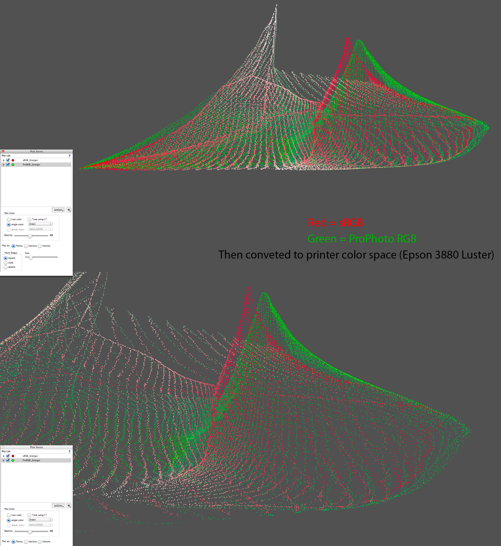


I can only take 12 minutes of this for now, but the first 12 minutes need a bit of work and I suspect I know what conclusions he'll make about ProPhoto RGB despite how my raw data is processed.
Logged
http://www.digitaldog.net/
Author "Color Management for Photographers".

Tim Lookingbill

  • Sr. Member
  • ****
  • Offline Offline
  • Posts: 2436
Re: Lee Varis' introduction to color management
« Reply #14 on: November 19, 2015, 03:56:54 pm »

Just watched Varis video on his opinions on using ProPhotoRGB as a working space. Yikes!

I had to comment on what so many still don't get about this work space. I would never work in any other space even on an sRGB display.

Varis is misrepresenting the functionality and purpose of that color space when it comes to editing color on a transmissive display.
Logged

digitaldog

  • Sr. Member
  • ****
  • Offline Offline
  • Posts: 20777
  • Andrew Rodney
    • http://www.digitaldog.net/
Re: Lee Varis' introduction to color management
« Reply #15 on: November 19, 2015, 08:02:25 pm »

Got to the end of the video, painful. The last part on high bit editing is, well you be the judge.


Here's what I learned from Lee in this video.


  • One can't future proof advances in printer technology to use a wider gamut space today (he places a big question mark there). So by recommending sRGB and maybe Adobe RGB (1998), there must not be any printer technology today that can use anything wider. Damn 8 color ink jets....
  • 90% of real world photo's  fit into sRGB and 99.9% of real world photo's fit inside of Adobe RGB. Those are Lee's stats. Where or how he came up with them is anyone's guess.
  • When viewing any gamut plot, if you see one plot outside the other, it's 'not much' of a difference.
  • Even colors in Adobe RGB that fall outside sRGB, it ain't much. So anything wider than sRGB isn't useful. Differences Lee reports are never significant.
  • High bit data isn't necessary. It's a scam by Adobe (and I suppose Nikon, Canon, PhaseOne, Schewe, Fraser and Rodney etc) to get you to buy bigger hard drives and more RAM.
  • All graphic cards are 8-bits.
  • Photoshop only provides 8-bit precision.
  • If you encounter banding, just add noise or blur the image.
  • Set your Photoshop working space for sRGB, 8-bit per color and be happy.  :P
Logged
http://www.digitaldog.net/
Author "Color Management for Photographers".

hugowolf

  • Sr. Member
  • ****
  • Offline Offline
  • Posts: 1001
Re: Lee Varis' introduction to color management
« Reply #16 on: November 19, 2015, 08:28:28 pm »

Got to the end of the video, painful.

You obviously have more will power than me.

It is isn't as deeply flawed as may out there, but there is a really ow bar on that.

Brian A
Logged

fdisilvestro

  • Sr. Member
  • ****
  • Offline Offline
  • Posts: 1859
    • Frank Disilvestro
Re: Lee Varis' introduction to color management
« Reply #17 on: November 19, 2015, 10:00:08 pm »

I think the intended audience are beginners who find all this subject overwhelming and want to have acceptable results out of their camera. I have seen many times people who are not interested in knowing all the details setting up their cameras for AdobeRGB because they were told it is better, and then they complain that the colors are muted.

Yes, for the 2 or 3 of us (paraphrasing another LuLa thread) that are interested in the subject and can potentially take advantage of wide gamut, high bit, etc. the video may looks as blasphemy, but hey, get over it, it was not intended for you.

Some notes:
You can have same RGB values in Adobe RGB translating to different Lab values
You can have same Lab values translating to different values in XYZ
and so on,

It is called Color Science for a reason

digitaldog

  • Sr. Member
  • ****
  • Offline Offline
  • Posts: 20777
  • Andrew Rodney
    • http://www.digitaldog.net/
Re: Lee Varis' introduction to color management
« Reply #18 on: November 19, 2015, 10:07:50 pm »

I think the intended audience are beginners who find all this subject overwhelming and want to have acceptable results out of their camera. I have seen many times people who are not interested in knowing all the details setting up their cameras for AdobeRGB because they were told it is better, and then they complain that the colors are muted.
That's why I created this video that's less than 2 minutes long: https://www.youtube.com/watch?v=G9JxXL_arbA
I asked early on, IF the idea is as you suggest, and that's possible, why spend any time talking about AtoB tables? That's going to aid the JPEG shooter how? The video's are like 40 minutes long so cut to the chase, tell folks who shoot 24-bit color JPEGs to just stick to sRGB. Easy, fast, to the point, accurate.
The facts presented in the two video's are in a number of areas, technically incorrect. I mean, all graphic cards are 8-bits?
Logged
http://www.digitaldog.net/
Author "Color Management for Photographers".

D Fosse

  • Guest
Re: Lee Varis' introduction to color management
« Reply #19 on: November 20, 2015, 02:29:43 am »

90% of real world photo's  fit into sRGB and 99.9% of real world photo's fit inside of Adobe RGB.

Actually that isn't too far from the truth, according to this: http://www.tftcentral.co.uk/articles/pointers_gamut.htm

Pointer's gamut is, in short, the gamut of reflected surface colors. Here compared to Adobe RGB:

<disclaimer: I didn't watch the video and have no opinions on it as such>
Logged
Pages: [1] 2 3 4   Go Up