Pages: 1 [2] 3 4 ... 10   Go Down

Author Topic: Moving from 35mm to Medium Format. Need guidance (Sorry for yet another thread!)  (Read 46907 times)

synn

  • Sr. Member
  • ****
  • Offline Offline
  • Posts: 1235
    • My fine art portfolio

Wow, GREAT stuff with that sharpening plugin, BartvanderWolf! I just ran a mis-focused photo from my archives through it and holy cow! The result was amazing!

Attached is a couple of screenshots. Before and after.

While it still can't do anything about the tonality, it does certainly go a long way towards adding some bite to the D800 files!

Thanks again!
Logged
my portfolio: www.sandeepmurali.com

Doug Peterson

  • Sr. Member
  • ****
  • Offline Offline
  • Posts: 4210
    • http://www.doug-peterson.com

I guess sharpening is an aesthetic/personal thing but that "recovered" image looks horridly digital to my eye. Granted it's making something out of an image that is out of focus, so I guess you can't complain.

Much, much better IMO to have natural appearing sharpness and microcontrast/bite to start with than to have to sharpen or fiddle with every image.

synn

  • Sr. Member
  • ****
  • Offline Offline
  • Posts: 1235
    • My fine art portfolio

Hi Doug,

Yes, this one is definitely overdone, I just had 2 minutes of play time with the plug-in! :)

I also agree that natural microcontrast is always better, which is why I am leaning towards MF in the first place!
Logged
my portfolio: www.sandeepmurali.com

Doug Peterson

  • Sr. Member
  • ****
  • Offline Offline
  • Posts: 4210
    • http://www.doug-peterson.com

One thing I have noticed from using the IQ160 (compared to Nikon and Canon DSLRs) is that it seems to show a wider range of hues. It shows differences in hues that the dslrs do not. Also all colors seem to have more "depth" to them. I do not know if I am using the right terminology but what happens is that there might be three slightly different reds in a scene for example and the dslr shows them as the same red color (even when taking care not to clip any channel) while the IQ160 will show three, slightly different reds, just like in reality. I do not know why that is but I believe it happens with all colors.

I normally refer to this as color discrimination. In other words the ability to discriminate or distinguish between subtle variations of a color. It's very useful in all sorts of photography but especially in nature where at first glance a subject (e.g. a fall foliage tree) only has a few colors, but, with proper capture and processing a nearly infinite variety of subtle colors come forward.

Someone said it above: if your camera captures and can distinguish between two colors you have complete flexibility in post especially in Capture One's Color Editor. You can leave the two colors as-is, increase the difference between them (Color Editor: select and increase uniformity), or decrease the difference between them (Color Editor: select both and rotate apart). But if the two colors are rendered identically

There are several technical elements that interact to increase or decrease color discrimination (CFA overlap, IR filter cutoff and sharpness, bit depth, etc etc) so pointing to any one element is usually futile. Since all engineering is a series of compromises the only way to get the very best color response is to start a design project with the mentality that you want quality above all other factors (e.g. quality vs cost, quality vs range of features, quality vs size).

Bart_van_der_Wolf

  • Sr. Member
  • ****
  • Offline Offline
  • Posts: 8914

I guess sharpening is an aesthetic/personal thing but that "recovered" image looks horridly digital to my eye. Granted it's making something out of an image that is out of focus, so I guess you can't complain.

Hi Doug,

It's also a matter of applying the 'correct' parameters. Attached is another rendering of the OOF original JPEG. This one was, to give some alternative options, a combination of upsampling, Topaz In-focus, Topaz Detail, down-sampling, and luminosity blend-if layer, all based on that JPEG.

Quote
Much, much better IMO to have natural appearing sharpness and microcontrast/bite to start with than to have to sharpen or fiddle with every image.

Of course, a better starting point is always preferable.

Cheers,
Bart
Logged
== If you do what you did, you'll get what you got. ==

TMARK

  • Sr. Member
  • ****
  • Offline Offline
  • Posts: 1841

I am not trying to disuade you from getting a MF system, but color on the D800 can be a challenge.  Custom profiles and styles are needed in C1.  Have you had a profile made for teh D800?  I only use the D800 for B&W now.  I think it is an amazing B&W camera.

Hi Torger,

very interesting insight about sensor technology. Thanks for that!

Regarding D800 files in Capture One, I have indeed tried to process the D800 files in it. I get a wee bit more resolution than in CNX2/ LR4, but the color rendering is totally off; no matter what color profile I use. To make matters worse, C1 doesn't have any option by which I can use a color checker to create a custom profile, Like I can with LR. In contrast, every Leaf file that I've dropped into C1 just looks amazing out of the box.

The below image is the best I can get out of the D800 after custom profiles, using a super sharp lens (The 85 f/1.8 G) and some high pass sharpening.


To my eyes, it still looks not quite "There". Maybe it's just me over analyzing.  ;D
Logged

Doug Peterson

  • Sr. Member
  • ****
  • Offline Offline
  • Posts: 4210
    • http://www.doug-peterson.com

I am a simple kinda shooter. Pocketwizard Plus III, Elinchrom Quadra, Sekonic meter, shoot. I don't have time for cludgy things like ND filters on the lens, hypersync this, HSS that etc. I like to have 1/800 sync out of the box and you know all roads lead to one place with that goal in mind.

FYI with a hard-line to the pack or with a Profoto Air transmitter you can actually get to 1/1600 with the more recent phase and leaf backs on a df or df+ with LS lenses.

The last time I genuinely needed 1/1600th was when I was shooting a family portrait on the beach at sunset and it started off overcast but the clouds let up and my subjects were blasted with direct sunlight I needed to knock down.

« Last Edit: October 07, 2013, 10:25:38 am by Doug Peterson »
Logged

Emilmedia

  • Full Member
  • ***
  • Offline Offline
  • Posts: 123
    • Emilmedia.se

I have not read what everyone else has written. But i'll speak from my own experience. I share a studio with 3 nikon d800 shooters. I used to shoot with a 5d mk ii myself. I moved to a hasselblad h3dii-39 about 6 months ago. Every time i do a shoot with the Hassy - me and my studio collegues are amazed by the image quality. There is something about the skin tones and softness of the images. I just LOVE the 100mm f2,2 lense. For every shoot i do i move more and more towards never shooting 35mm again.

The iso is terrible, the focus is terrible and the camera is terribly heavy. I don't care - I LOVE IT.

ErikKaffehr

  • Sr. Member
  • ****
  • Offline Offline
  • Posts: 11311
    • Echophoto

Hi,

Yes, I agree. But the image seems unsharp to begin with. I would guess out of focus.

I have played around a lot with different tools, but what I have found works best for me is Lightroom's sharpening with low radius 0.7 - 1.0 around 45% amount and 75-100% detail. Another way is to use high amount (say 100) but detail set to 0.

Regarding Focus Magick, Topaz InFocus and so on I actually prefer Smart Sharpen in Photoshop. It does also do deconvolution.

Interestingly, I use the same parameters for Sony Alpha 99 and Hasselblad/P45+. Could be that the Zeiss lenses can take a bit more sharpening than newer designs.

It is well possible that Capture 1 has slightly more detail and I am quite certain that it produces less color artefacts.

Best regards
Erik

I guess sharpening is an aesthetic/personal thing but that "recovered" image looks horridly digital to my eye. Granted it's making something out of an image that is out of focus, so I guess you can't complain.

Much, much better IMO to have natural appearing sharpness and microcontrast/bite to start with than to have to sharpen or fiddle with every image.
« Last Edit: October 08, 2013, 05:30:50 am by ErikKaffehr »
Logged
Erik Kaffehr
 

ErikKaffehr

  • Sr. Member
  • ****
  • Offline Offline
  • Posts: 11311
    • Echophoto

Hi,

It is impossible to judge sharpness and fine detail contrast from a web size print. If you want to discuss sharpness, please post raw images or at least 1:1 crops.

Personally, I am a landscape shooter. Also, I just have MFD (P45+) for something like 3 months. The main difference I see is resolution, my DSLR is Sony Alpha 99 and the MFDB is a P45+, the resolution difference is quite visible on screen, but I guess not very visible in prints (OK, I see no difference in A2 prints and little in 70x100 cm (34x40") prints). I cannot say if any image I shot is from Sony Alpha or Phase One P45+, unless doing an analytical comparison or reading EXIF data. But, P45+ images are more yellowish and a bit sharper. They are also a bit noisier in the shadows. So, there are clues to pick up...

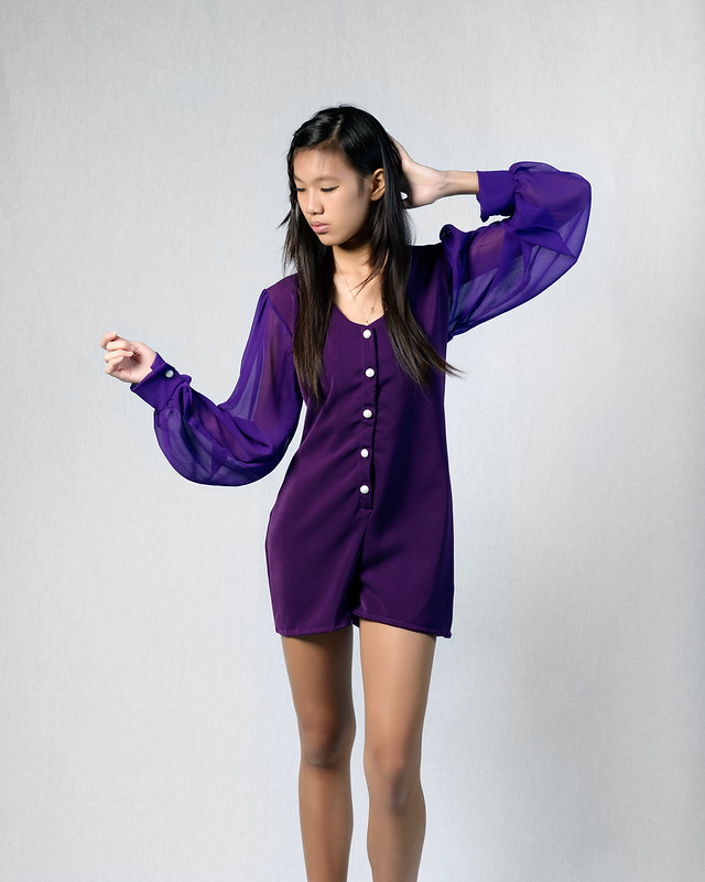
As I am a lanscape shooter, I am not very interested in skin tones. The cloth in the image is probably difficult, violet/purple are not spectral colors, they are a perceived mixture of two spectral colors. A violet flower can come out blue with one profile and reddish violet on another profile. Perception plays a major role. Accurate is not the same as pleasant. This has also a lot to do with contrast ranges. A good sensor has probably a contrast range of 13 EV, something like 1:8196 contrast ratio, when we show it on screen we need to compress it to around 1:500 (9 bits or 9 EV). In print we can only have something like 1:128 ratio, around 7EV. So tonal range is always mapped down. A straight mapping would yield boring images, so mapping usually involves pushing local contrast and saturation.

What is happening is that you can observe a few millions of colors. Those millions of colors are mapped down two three distinct intensities, R, G and B. That is all the sensor does! The three signals than processed adjusted for white balance and converted to RGB by a color profile. You make a lot of adjustment to the RGB values. Those RGB values are put trogh some numerical processing to  convert to screen or printer color space.

So it is a long process. A mix of spectral colors-> a single RGB signal -> Convert to input color space -> color space conversion for viewing -> adjustments ->color space conversion for printing. The sensor is only involved in the first step, converting millions of colors into three different discrete signals. Have you considered this?


Best regards
Erik


Hi Torger,

very interesting insight about sensor technology. Thanks for that!

Regarding D800 files in Capture One, I have indeed tried to process the D800 files in it. I get a wee bit more resolution than in CNX2/ LR4, but the color rendering is totally off; no matter what color profile I use. To make matters worse, C1 doesn't have any option by which I can use a color checker to create a custom profile, Like I can with LR. In contrast, every Leaf file that I've dropped into C1 just looks amazing out of the box.

The below image is the best I can get out of the D800 after custom profiles, using a super sharp lens (The 85 f/1.8 G) and some high pass sharpening.


To my eyes, it still looks not quite "There". Maybe it's just me over analyzing.  ;D
« Last Edit: October 08, 2013, 03:44:15 pm by ErikKaffehr »
Logged
Erik Kaffehr
 

synn

  • Sr. Member
  • ****
  • Offline Offline
  • Posts: 1235
    • My fine art portfolio

Hi Emil,

Yes, those are my thoughts too! :)


Hi Erik,

The sample you have quoted was actually posted not to demonstrate sharpness, but to show tonality. Getting those skintones out of a D800 is hard work in Lightroom, even harder in Capture One. Getting those from a Leaf file is as simple as just importing into Capture One.

As someone mentioned earlier, the ability for an MF back to capture subtle differences in variations of the same color is what's probably helping in tonality. Without going into too much technicality, all I can say is that no matter what's going on in the backend, the files I have processed from MF backs deliver much better skintones out of the box than 35mm files, that too with much lesser work. For a portrait shooter, this is very, very important.
Logged
my portfolio: www.sandeepmurali.com

ErikKaffehr

  • Sr. Member
  • ****
  • Offline Offline
  • Posts: 11311
    • Echophoto

Hi,

You had a comment when you posted the image: "The below image is the best I can get out of the D800 after custom profiles, using a super sharp lens (The 85 f/1.8 G) and some high pass sharpening.".  That was the reason I discussed sharpening.

My guess is that Capture 1 puts a lot of emphasis on skin tones under studio conditions and also has a set of tools to enhance skin tones. I don't think it is much related to sensor design.

Color is a bit up to taste. I have a P45+ and I have mixed feelings regarding the colors. The P45+ has a Kodak chip while P65+ and later have DALSA. The DALSA sensors are said to have better colors. Just to say that not all MFDBs are created equal.

I tried to look into color previously and I have not arrived to any conclusion: http://echophoto.dnsalias.net/ekr/index.php/photoarticles/71-mf-digital-myths-or-facts?start=9


Here are some sample posts with P45+ and different profiles in LR and also Capture 1, just two shots, white balance on gray card (ColorChecker Passport)

http://echophoto.dnsalias.net/ekr/Articles/MFDJourney/Color/ColorTuning/Samples/3750_FULL/

http://echophoto.dnsalias.net/ekr/Articles/MFDJourney/Color/ColorTuning/Samples/3750_Persons/

http://echophoto.dnsalias.net/ekr/Articles/MFDJourney/Color/ColorTuning/Samples/3756_FULL/

http://echophoto.dnsalias.net/ekr/Articles/MFDJourney/Color/ColorTuning/Samples/3756_flower/


Best regards
Erik


Hi Erik,

The sample you have quoted was actually posted not to demonstrate sharpness, but to show tonality. Getting those skintones out of a D800 is hard work in Lightroom, even harder in Capture One. Getting those from a Leaf file is as simple as just importing into Capture One.

As someone mentioned earlier, the ability for an MF back to capture subtle differences in variations of the same color is what's probably helping in tonality. Without going into too much technicality, all I can say is that no matter what's going on in the backend, the files I have processed from MF backs deliver much better skintones out of the box than 35mm files, that too with much lesser work. For a portrait shooter, this is very, very important.
« Last Edit: October 09, 2013, 01:20:32 am by ErikKaffehr »
Logged
Erik Kaffehr
 

satybhat

  • Newbie
  • *
  • Offline Offline
  • Posts: 35

Hi Sandeep,

Hi-pass sharpening is an edge contrast enhancing procedure, it will never produce the same effect as a shot with a sensor without AA-filter. The MFDB AA-filterless shot will be aliased, and have a higher MTF at the lower spatial frequencies, which can only be approximated by using deconvolution sharpening.

I suggest you give the FocusMagic plugin for Photoshop a try, preferably on a luminosity blend-if layer (which will avoid highlight clipping). The layered approach also allows to mask out skin, and leave hair and other detail in. It works even better if you first up-sample the image, apply deconvolution sharpening, and then down-sample back to the original file size, and add a tiny bit more deconvolution sharpening. Resolution and MTF of micro-detail is boosted by restoring actual resolution, not by adding contrast.

It's hard to suggest a different approach when all we have is subjective impressions to go on. Capture One offers very good Raw conversion quality, and it has a number of features specifically aimed at skin tone color. Tonality is a function of local contrast, and overall tone-curve. I prefer to use a Linear response curve, and if necessary tweak the highlight roll-off exactly to my liking. I prefer natural highlights, not compressed film-like highlights, but that can be changed by adjusting the curves or highlight control in Capture One.

For overall tonality, there is (IMHO) no better tool than Topaz Labs "Clarity" plugin, although I use it in combination with their "Adjust" plugin. These two give huge control over tonality, including some interesting masking functionality, e.g. for targeting skin tones.

By all means, if that rocks your boat, go for it. But I do get a feeling that there are improvements possible with your current post-processing. Also remember that all files need some post-processing, but the amount also depends on one's personal preferences. Only you can judge that.

That may have something to do with the particular choice of Bayer CFA filter colors, which may happen to do well with skincolor in general, but there are many skincolors so I'm not 100% sure that the filter response is the only reason. Capture One does use ICC profiles that may give a better starting point as well, compared to other converters. And again, specific skin color control is also part of Capture One, and many users report that it works wonders.

Cheers,
Bart

bookmarked !  ;)
Logged

ErikKaffehr

  • Sr. Member
  • ****
  • Offline Offline
  • Posts: 11311
    • Echophoto

Hi,

I agree Bart on most issues, just want to say that I just retested FocusMagic on image with what may be less than optimal focus and got really outstanding results. Don't really have time make a good demo, but below is a sample of the Magic IM can do.

Yeah, probably oversharpened, I know...

Best regards
Erik


Hi Sandeep,


I suggest you give the FocusMagic plugin for Photoshop a try, preferably on a luminosity blend-if layer (which will avoid highlight clipping). The layered approach also allows to mask out skin, and leave hair and other detail in. It works even better if you first up-sample the image, apply deconvolution sharpening, and then down-sample back to the original file size, and add a tiny bit more deconvolution sharpening. Resolution and MTF of micro-detail is boosted by restoring actual resolution, not by adding contrast.


Cheers,
Bart
Logged
Erik Kaffehr
 

Aphoto

  • Jr. Member
  • **
  • Offline Offline
  • Posts: 65
    • Architectural photography, Berlin

Hi,

I agree Bart on most issues, just want to say that I just retested FocusMagic on image with what may be less than optimal focus and got really outstanding results. Don't really have time make a good demo, but below is a sample of the Magic IM can do.

Yeah, probably oversharpened, I know...

Best regards
Erik


I used FocusMagic before there was PhotoshopCC around. The new Smartsharpen Filter in PS-CC is even better than FocusMagic. But the results are still close.

Logged
Best, Adrian // www.adrianschulz.com

Bart_van_der_Wolf

  • Sr. Member
  • ****
  • Offline Offline
  • Posts: 8914

I used FocusMagic before there was PhotoshopCC around. The new Smartsharpen Filter in PS-CC is even better than FocusMagic. But the results are still close.

Hi Adrian,

It might be interesting to put that to the test on e.g. the challenging image crop in this thread, and add the result there as well.

As far as I know, the deconvolution algorithm of 'Smart Sharpen' hasn't changed, it just got some more controls to fight the artifacts, which is always a good thing.

Cheers,
Bart
Logged
== If you do what you did, you'll get what you got. ==

ErikKaffehr

  • Sr. Member
  • ****
  • Offline Offline
  • Posts: 11311
    • Echophoto

Hi,

I have used Focus Magick before and have not found it beneficial compared with Smart Sharpen, but I have now tested it on a presharpened image with DoF issues and got amazingly good results.

Best regards
Erik


I used FocusMagic before there was PhotoshopCC around. The new Smartsharpen Filter in PS-CC is even better than FocusMagic. But the results are still close.


Logged
Erik Kaffehr
 

Aphoto

  • Jr. Member
  • **
  • Offline Offline
  • Posts: 65
    • Architectural photography, Berlin

Hi Adrian,

It might be interesting to put that to the test on e.g. the challenging image crop in this thread, and add the result there as well.

As far as I know, the deconvolution algorithm of 'Smart Sharpen' hasn't changed, it just got some more controls to fight the artifacts, which is always a good thing.

Cheers,
Bart

here is a quick try:

www.adrianschulz.de/forum/a33fw4n3.jpg

Original:
http://bvdwolf.home.xs4all.nl/main/downloads/0343_Crop+Diffraction.png
Logged
Best, Adrian // www.adrianschulz.com

Bart_van_der_Wolf

  • Sr. Member
  • ****
  • Offline Offline
  • Posts: 8914

here is a quick try:

www.adrianschulz.de/forum/a33fw4n3.jpg

Yes, that's quite usable. Not the best possible, but good enough for most uses. Most methods have difficulty picking up the venetian blinds behind the windows at he bottom left of the tree trunk, and clearly separating the vertical spokes of the balcony railings without ringing while maintaining a three dimensional look.

Cheers,
Bart
Logged
== If you do what you did, you'll get what you got. ==

Steve Hendrix

  • Sr. Member
  • ****
  • Offline Offline
  • Posts: 1662
    • http://www.captureintegration.com/

Synn -

Based on the way you work, medium format seems a viable choice for you.

The D800 is such an interesting camera as I have heard both raves and complaints about the file. Perhaps it's just post processing - getting the color right. Hard to say - but certainly it might be worth seeking out some counsel on getting the most out of the Nikon file and then see if you still feel it doesn't have that certain something for you.

I'm not surprised you are swayed by the Leaf skin tones.

If you do end up pursuing a medium format system, there's no reason to not consider a Leaf Aptus-II 7 or 8. I have generally felt like the Aptus-II 7 would be a better choice for portraiture, the larger sensor and fewer pixels providing more of a different feel than 35mm, but I've also not had any complaints from anyone who moved downstream to an Aptus-II 8 (or P40+) from a larger sensor like an Aptus 22 (or P25+). In fact, they've been universally pleased. I don't feel the extra 7 megapixels is significant, but it's true the Aptus-II 8 will be less prone to moire and have a slightly cleaner result at ISO 100/200/400 (if you would use those).

If you imagine shooting with a Leaf digital back and loving the files, then the real question becomes the camera. Since you like the 24mm equivalent - your only option there is 35mm on a sensor the size of the Aptus-II 7, which is closest, translating to a 25mm. The 28mm becomes 20mm - very wide. On the Aptus-II 8, the 28 becomes 22mm, maybe also too wide. And the 35mm becomes 28mm, maybe not wide enough. So - key question - how important is that focal length to you? If it's real important, then that also means if you end up with an Aptus-II 7/35mm combo, that your only option would be a Hasselblad H camera with the 35mm lens, since no other 35mm leaf shutter lens exists.

A lot to think about - but I think first it is real important to make sure you're getting the most out of your D800.

Also, not having a local Hy6 dealer doesn't mean you can't get support on that system.  ;)


Steve Hendrix
Capture Integration
Logged
Steve Hendrix • 404-543-8475 www.captureintegration.com (e-mail Me)
Phase One | Leaf | Leica | Alpa | Cambo | Sinar | Arca Swiss
Pages: 1 [2] 3 4 ... 10   Go Up