Thank you very much for all the input. This is great!
If you don't do this, it's a waste of time. Everyone has different interpretations on what considered a "dark" print while at the same time not letting us see just how much light the print is being lit by.
Here's an example (pardon the mess)
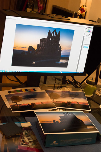 20121120-_TP50991
 by
sunnyUK, on Flickr
The room is lit by 4 halogen bulbs overhead, two of which are bounced off a white wall. They are not daylight bulbs.
The problem with the prints is most easily seen in the shadow detail (or rather, the lack of shadow detail on the print). I have also watched the print outdoor in "real" daylight, and the shadows are also way darker there than on-screen.
Thank you for the very interesting thread about daylight bulbs. I will have to look into that in more detail when/if I get a separate room for my photo work.
Lower or raise either until you get a visual match.
If I lower the luminosity of the monitor, the shadow details dissapear there. While that sounds like an improvement, it isn't really, because it hides detail that
is in the image. What I would like to achieve is for the monitor to show me everything that is in the image, and only throw away detail when it comes to softproofing (if the problem is caused by the printer's inability to print as fine luminosity details). And even "real" daylight won't show me the shadow details.
1. using Photoshop create a duplicate layer of your finished photo
2. make sure this is the top layer
3. set the blend mode of this duplicate layer to "Screen"
4. set the opacity of this layer to ~ 25-30%
5. print and be amazed
(this tip is credited to Matt Kloskowski from NAPP)
That seems to work really well, and definitely bring some details out in the picture which weren't visible before. I would still prefer to just softproof and see there what the print would look like, but in the interim this is most certainly a work-around I'll use. Thank you!!
Work with a white canvas in Photoshop...
I'm afraid I don't follow you. It's not a general perception issue, it is the fact that there are details on-screen that are
very close to invisible on the print. I don't think changing the canvas colour is going to change that. Am I missing a point here?
This sounds like a good workaround, but why not complete the calibration process by matching the luminance of the monitor to the viewing situation first, as suggested by DigitalDog? Until you have done that, you have not finished setting up your softproofing environment. Once you have done that, you know that you can depend on more effective and accurate (never perfect, of course) softproofing. I speak from experience. It is really very, very reassuring to know that my hard work on images will produce consistent results.
I would prefer to do as you suggest. Hence my original post asking for help figuring out what to do. I don't want to reduce the luminosity of the monitor so much that it throws away detail - that would sorta defy the purpose of having a good monitor. And I can't see all details in the print regardless of how much light I throw at it.
So I'm still hoping there is a step in the softproofing setup I can complete that will be able to give me the best of both worlds, so to speak. A monitor that can show all the details in the file, and a softproof that can show me what the printer will print. That's the holy grail, innit?
Thanks again for all the input, and please keep it coming.
