Pages: [1]   Go Down

Author Topic: Should I be able to see differences in prints from Pro Photo vs Adobe RGB?  (Read 1774 times)

russellcbanks

  • Newbie
  • *
  • Offline Offline
  • Posts: 7

After reading about the effects of working in the Pro Photo RGB versus Adobe RGB color space and 8-bit versus 16-bit printing, decided to test those variables with a couple of photographs that are representative of my usual work.

I tried every combination, making letter sized Prince, and try as I might, I can see no difference at all. If I use my imagination I might be able to see a tiny bit more detail in a very small area of contrasting wrinkles on a distant face with the 16-bit printing. But that’s all.

I've been making prints for about 50 years, both analog (with Ilford Gallerie and Beers developers) and for the last 15 years with digital technology, so I'm pretty good printer and usually very sensitive to variations.

I'm printing with Photoshop and an Epson 3880 on Epson Lustre paper.

Is this the experience of others in this forum? Are my eyes going bad?

Perhaps it is best to go with the larger color space (and maybe 16 bit printing) only if you see banding in smooth areas. And I've never seen banding in my images, printed up to 17x22, working in adobe RGB.

Thanks,
Russell
Logged

digitaldog

  • Sr. Member
  • ****
  • Offline Offline
  • Posts: 20651
  • Andrew Rodney
    • http://www.digitaldog.net/

The benefits of wide gamut working spaces on printed output:

This three-part, 32-minute video covers why a wide gamut RGB working space like ProPhoto RGB can produce superior quality output to print.

Part 1 discusses how the supplied Gamut Test File was created and shows two prints output to an Epson 3880 using ProPhoto RGB and sRGB, how the deficiencies of sRGB gamut affect final output quality. Part 1 discusses what to look for on your own prints in terms of better color output. It also covers Photoshop’s Assign Profile command and how wide gamut spaces mishandled produce dull or oversaturated colors due to user error.

Part 2 goes into detail about how to print two versions of the properly converted Gamut Test File file in Photoshop using Photoshop’s Print command to correctly setup the test files for output. It covers the Convert to Profile command for preparing test files for output to a lab.

Part 3 goes into color theory and illustrates why a wide gamut space produces not only move vibrant and saturated color but detail and color separation compared to a small gamut working space like sRGB.

High Resolution Video: http://digitaldog.net/files/WideGamutPrintVideo.mov
Low Resolution (YouTube): https://www.youtube.com/watch?v=vLlr7wpAZKs&feature=youtu.be
Logged
http://www.digitaldog.net/
Author "Color Management for Photographers".

digitaldog

  • Sr. Member
  • ****
  • Offline Offline
  • Posts: 20651
  • Andrew Rodney
    • http://www.digitaldog.net/

16-bit to the Epson is pointless and buggy.
Logged
http://www.digitaldog.net/
Author "Color Management for Photographers".

russellcbanks

  • Newbie
  • *
  • Offline Offline
  • Posts: 7

Thanks, Andrew. This is very helpful.

I can see that there might be quite a difference, comparing Pro Photo to sRGB. I'll take a look at the videos you suggested.

I would expect my comparison of Pro Photo to Adobe RGB to show a bit less difference. I was particularly interested in Adobe RGB because my Eizo display can supposedly show the full range of Adobe RGB. With Pro Photo, there's a potential of seeing subtleties in your print that you couldn't see on the display, right? Of course, that's probably not a bad thing!

Best,
Russell
Logged

digitaldog

  • Sr. Member
  • ****
  • Offline Offline
  • Posts: 20651
  • Andrew Rodney
    • http://www.digitaldog.net/

You'll see far less of a difference between Adobe RGB (1998) and ProPhoto RGB, but if the question is: Can I capture and output colors that exceed Adobe RGB (1998), the answer is yes!
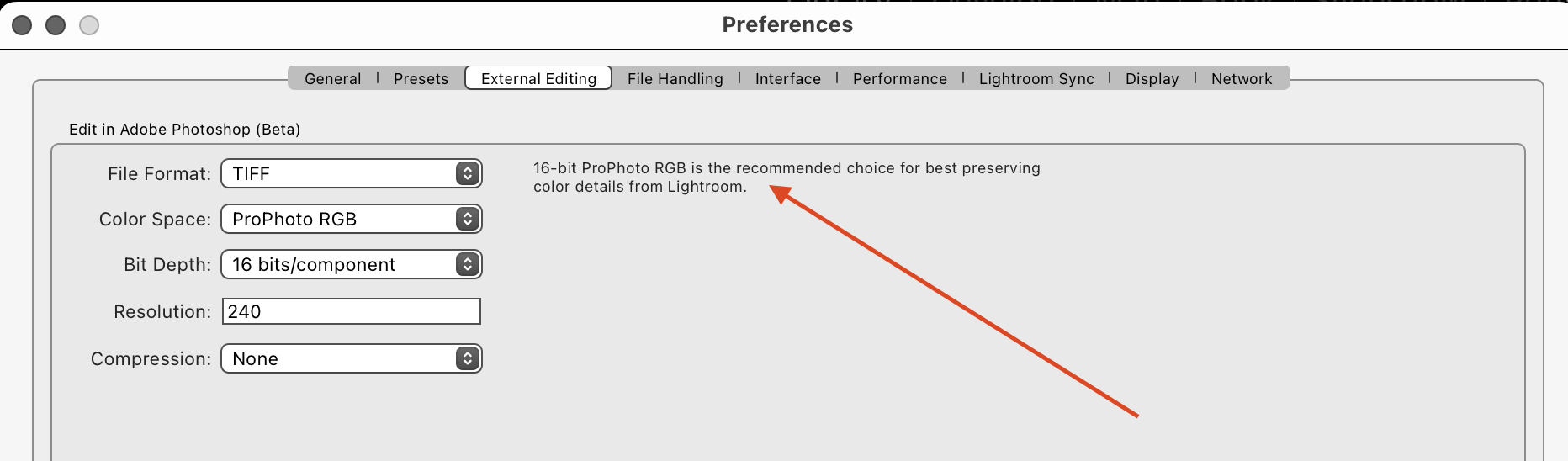
And there's this recommendation too:

Then the question becomes, do you encode into a color space far larger than your display, producing colors you may not be able to see there but can output?
For me, the answer is yes.

Simple matrix profiles of RGB working spaces when plotted 3 dimensionally illustrate that they reach their maximum saturation at high luminance levels. The opposite is seen with print (output) color spaces. Printers produce color by adding ink or some colorant, while working space profiles are based on building more saturation by adding more light due to the differences in subtractive and additive color models. To counter this, you need a really big RGB working space like ProPhoto RGB again due to the simple size and to fit the round peg in the bigger square hole. RGB working spaces have shapes which are simple and predictable and differ greatly from output color spaces. Then there is the issue of very dark colors of intense saturation which do occur in nature and we can capture with many devices. Many of these colors fall outside Adobe RGB (1998) and when you encode into such a color space or smaller gamut, you clip the colors to the degree that smooth gradations become solid blobs in print, again due to the dissimilar shapes and differences in how the two spaces relate to luminance. So the advantage of ProPhoto isn't only about retaining all those out-of-gamut colors it's also about maintaining the dissimilarities between them, so that you can map them into a printable color space as gradations rather than ending up as blobs. 

Here is a link to a TIFF that I built to show the effect of the 'blobs' and lack of definition of dark but saturated colors using sRGB (Red dots) versus the same image in ProPhoto RGB (Green dots). The image was synthetic, a Granger Rainbow which contains a huge number of possible colors. You can see that the gamut of ProPhoto is larger as expected. But notice the clumping of the colored red vs. green dots in darker tones which are lower down in the plot. Both RGB working space were converted to a final output printer color space (Epson 3880 Luster). 

http://www.digitaldog.net/files/sRGBvsPro3DPlot_Granger.tif
Logged
http://www.digitaldog.net/
Author "Color Management for Photographers".

fdisilvestro

  • Sr. Member
  • ****
  • Offline Offline
  • Posts: 1854
    • Frank Disilvestro

Try with gradients of yellows to full saturation. This is one of the areas where the gamut of the paper/ink combination usually exceeds AdobeRGB

nirpat89

  • Sr. Member
  • ****
  • Offline Offline
  • Posts: 661
    • Photography by Niranjan Patel

After reading about the effects of working in the Pro Photo RGB versus Adobe RGB color space and 8-bit versus 16-bit printing, decided to test those variables with a couple of photographs that are representative of my usual work.

I tried every combination, making letter sized Prince, and try as I might, I can see no difference at all. If I use my imagination I might be able to see a tiny bit more detail in a very small area of contrasting wrinkles on a distant face with the 16-bit printing. But that’s all.

I've been making prints for about 50 years, both analog (with Ilford Gallerie and Beers developers) and for the last 15 years with digital technology, so I'm pretty good printer and usually very sensitive to variations.

I'm printing with Photoshop and an Epson 3880 on Epson Lustre paper.

Is this the experience of others in this forum? Are my eyes going bad?

Perhaps it is best to go with the larger color space (and maybe 16 bit printing) only if you see banding in smooth areas. And I've never seen banding in my images, printed up to 17x22, working in adobe RGB.

Thanks,
Russell

Isn't the colorspace more about color fidelity, not so much about reproduction of the details or the sharpness of the image?

:Niranjan.

Logged

digitaldog

  • Sr. Member
  • ****
  • Offline Offline
  • Posts: 20651
  • Andrew Rodney
    • http://www.digitaldog.net/

Isn't the colorspace more about color fidelity, not so much about reproduction of the details or the sharpness of the image?

:Niranjan.
Sharpness no.
Color “fidelity” and details are shown in the URL earlier; yes!
Logged
http://www.digitaldog.net/
Author "Color Management for Photographers".

Doug Gray

  • Sr. Member
  • ****
  • Offline Offline
  • Posts: 2197

Then the question becomes, do you encode into a color space far larger than your display, producing colors you may not be able to see there but can output?
For me, the answer is yes.
Generally also yes. A big problem is the way a wide gamut monitor displays both printable and unprintable colors that are outside the monitor's gamut. Typically, I'll just decrease the saturation percentage as needed (10% to 30%) to allow the monitor to kind of work. Colors are less saturated overall but the luminosity shifts that otherwise occur are controlled. No perfect solution but reducing the saturation percentage can make it easier to see areas where the printer gamut is exceeded and what gets printed when that happens.

No perfect proofing solution. Trial and error and a deep dive into the ICC profiles work for both printers and monitors helps to make sense of it all.
Logged

russellcbanks

  • Newbie
  • *
  • Offline Offline
  • Posts: 7

Sharpness no.
Color “fidelity” and details are shown in the URL earlier; yes!

It makes sense that sharpness is not the same as detail. I've had situations where decreasing the saturation of an intense color reveals gradation (detail) that wasn’t previously visible. Perhaps the colors were out-of-gamut and converted to one color by the rendering intent.
Logged

MichaelEzra

  • Sr. Member
  • ****
  • Offline Offline
  • Posts: 1146
    • https://www.michaelezra.com

I recall there is a bug when prining via Epson driver via Photoshop on Windows that affects gamma of the prints.
When Working color space is ProPhoto (gamma 1.8 ) the printer output is consistently darker.
When Working color space is AdobeRGB 1998, the prints have correct brightness/gamma.

There should be no reason to not to use ProPhotoRGB as working space and keep all intermediate files in ProPhoto RGB, then convert the properly sized image to printer/paper/ink ICC profile.
The inconvenience is that for printing I find that I must not forget to switch the working space to Adobe RGB, before sending image to the printer.

Logged

Rand47

  • Sr. Member
  • ****
  • Offline Offline
  • Posts: 1882

I recall there is a bug when prining via Epson driver via Photoshop on Windows that affects gamma of the prints.
When Working color space is ProPhoto (gamma 1.8 ) the printer output is consistently darker.
When Working color space is AdobeRGB 1998, the prints have correct brightness/gamma.

There should be no reason to not to use ProPhotoRGB as working space and keep all intermediate files in ProPhoto RGB, then convert the properly sized image to printer/paper/ink ICC profile.
The inconvenience is that for printing I find that I must not forget to switch the working space to Adobe RGB, before sending image to the printer.

I’m Windows 10 on PC.  Wide gamut monitor, properly profiled.  Use Solux 4700k for inspection area.  Have used ProPhoto RGB as my working color space for years now.  Have owned several Epson printers: 4880, 5000, P 800, P 600, and P 7570.  I’ve never had, or even heard of, this kind of issue.  Often, my screen to print match is “scary good” with a paper like Ilford’s Gold Fibre Gloss and custom ICC profile.

As to the OP’s question.  Andrew’s videos on color spaces should answer that question.   Based on what I’ve learned from Andrew, I’ve made two sets of 4 prints.  One set from his test file.  One set from a really colorful “fall colors” mountain scene.  The prints are:  sRGB, Adobe RGB, ProPhoto RGB, and last ProPhoto RGB carefully soft-proofed.  The differences are quite obvious.

Rand
« Last Edit: May 15, 2023, 10:34:47 am by Rand47 »
Logged
Rand Scott Adams

digitaldog

  • Sr. Member
  • ****
  • Offline Offline
  • Posts: 20651
  • Andrew Rodney
    • http://www.digitaldog.net/

I recall there is a bug when prining via Epson driver via Photoshop on Windows that affects gamma of the prints.
When Working color space is ProPhoto (gamma 1.8 ) the printer output is consistently darker.
When Working color space is AdobeRGB 1998, the prints have correct brightness/gamma.

I’ve never had, or even heard of, this kind of issue. 

News to me too.
Logged
http://www.digitaldog.net/
Author "Color Management for Photographers".

Guillermo Luijk

  • Sr. Member
  • ****
  • Offline Offline
  • Posts: 2005
    • http://www.guillermoluijk.com

After reading about the effects of working in the Pro Photo RGB versus Adobe RGB color space and 8-bit versus 16-bit printing, decided to test those variables with a couple of photographs that are representative of my usual work.

I tried every combination, making letter sized Prince, and try as I might, I can see no difference at all. If I use my imagination I might be able to see a tiny bit more detail in a very small area of contrasting wrinkles on a distant face with the 16-bit printing. But that’s all.

I've been making prints for about 50 years, both analog (with Ilford Gallerie and Beers developers) and for the last 15 years with digital technology, so I'm pretty good printer and usually very sensitive to variations.

I'm printing with Photoshop and an Epson 3880 on Epson Lustre paper.

Is this the experience of others in this forum? Are my eyes going bad?

Perhaps it is best to go with the larger color space (and maybe 16 bit printing) only if you see banding in smooth areas. And I've never seen banding in my images, printed up to 17x22, working in adobe RGB.

I would like to see first the histogram of your Adobe RGB image version. Unless it has clipped colours (which you will detect as peaks in the left and/or the right end of the histogram), no colours in your scene fall out of the Adobe RGB gamut. If this is the case, there can be no advantage in going to ProPhoto RGB. In fact the Adobe RGB encoding wil be more robust as it will have softer (richer) numerical gradients; not meaning that you will be able to see them on screen or print.

The smallest gamut colour space that can encode all existing colours in your image, will always provide equal or higher quality when displayed or printed than wider colour spaces.

This is an 8-bit image that can be properly represented in sRGB (i.e. it has no colours falling outside the sRB gamut). The numbers represent how many different RGB colour combinations the same image has after being encoded in sRGB (376K colours), Adobe RGB (263K colours) and ProPhoto RGB (158K colours):

http://www.guillermoluijk.com/article/ledlight/srgbvsprophotorgb.png

Regards
« Last Edit: June 23, 2023, 07:02:08 pm by Guillermo Luijk »
Logged
Pages: [1]   Go Up