Pages: 1 ... 3 4 [5] 6 7 8   Go Down

Author Topic: Phase One Trichromatic In Depth Article with Raw Files  (Read 34349 times)

eronald

  • Sr. Member
  • ****
  • Offline Offline
  • Posts: 6642
    • My gallery on Instagram
Re: Hi - lot of questionable info in that article +1
« Reply #80 on: October 30, 2017, 10:21:29 pm »

Hi Jack,

Thanks for the info, it seems I need to cancel one order and make another one!

Best regards
Erik

Erik,


I think the Hunt book I own is "measuring color", but I only used it for reference, not to learn. I think it doesn't really matter which book you own provided you understand the logic which postulates a scientific explanation of the factors which evoke the sensation. Because in the end, make no mistake, it is a sensation. And then a well written book will explain the issues of color spaces etc, which are placeholder representations for this sensation which  represent certain measurements.

Although this is probably high-school philosophy, I think that listing the *factors* which enable and evoke the sensation is a more constructive exercise than perfecting the representations. But that is probably a professional deformation of a senile PhD. However, good lighting in museums would make me happier than accurate print in magazines :)

Professor Hunt is interesting because he helped create some of the first color emulsions, I believe, and also some of the first color TV systems, so he understands what choices got made at the start of the game.

I personally continue to feel that accurate color reproduction by storing color information in files is a losing proposition because the variation of the sensation in the population is too strong due to genetic variation in the pigments in the eyes. Multispectral representation make more sense IMHO.

Edmund
Logged
If you appreciate my blog posts help me by following on https://instagram.com/edmundronald

ErikKaffehr

  • Sr. Member
  • ****
  • Offline Offline
  • Posts: 11311
    • Echophoto
Re: Hi - lot of questionable info in that article +1
« Reply #81 on: October 30, 2017, 11:58:32 pm »

Hi Edmund,

The reason I am interested in buying the 'Hunt book' is to learn more about colour and the reason is that I am interested in the issue. It has been on my shopping list for a long time, a couple of years.

I know that perception of colour is complex, Bill (BJanes had a link to a very interesting discussion, here: https://www.dpreview.com/forums/post/34102685 )


Best regards
Erik


Erik,


I think the Hunt book I own is "measuring color", but I only used it for reference, not to learn. I think it doesn't really matter which book you own provided you understand the logic which postulates a scientific explanation of the factors which evoke the sensation. Because in the end, make no mistake, it is a sensation. And then a well written book will explain the issues of color spaces etc, which are placeholder representations for this sensation which  represent certain measurements.

Although this is probably high-school philosophy, I think that listing the *factors* which enable and evoke the sensation is a more constructive exercise than perfecting the representations. But that is probably a professional deformation of a senile PhD. However, good lighting in museums would make me happier than accurate print in magazines :)

Professor Hunt is interesting because he helped create some of the first color emulsions, I believe, and also some of the first color TV systems, so he understands what choices got made at the start of the game.

I personally continue to feel that accurate color reproduction by storing color information in files is a losing proposition because the variation of the sensation in the population is too strong due to genetic variation in the pigments in the eyes. Multispectral representation make more sense IMHO.

Edmund
Logged
Erik Kaffehr
 

ErikKaffehr

  • Sr. Member
  • ****
  • Offline Offline
  • Posts: 11311
    • Echophoto
Re: Phase One Trichromatic In Depth Article with Raw Files
« Reply #82 on: October 31, 2017, 01:24:59 am »

Hi Wayne,

Michael Reichmann has a very nice video with Ray Maxwell, discussing colour: https://luminous-landscape.com/videos/luminous-landscape-video-journal-issue-17/interview-ray-maxwell-colour/

The normalized colour response curve of the eye that Doug shows are quite correct. The reason they work as well as they do is that brain does a lot of processing. Would we use eye like curves in cameras we would need to math to separate red and green that would increase noise.

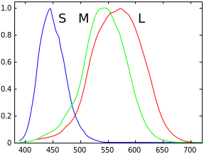
Spectral sensivity of human vision, according to Doug:


Spectral sensivity of human vision, according to Wikipedia:


 The issue with Doug's article, or rather Phase One's presentation is that both state that traditional sensors work very differently than they do.

All spectral plots of sensors I have seen are very similar to what Phase One / Doug calls the new approach, but it is hard to compare curves as he gives no scales.

It has often been stated that CFA-s would been made more permissive to increase ISO. But, there is little proof that less overlap improve colour rendition, on the contrary, that may lead to a certain colour blindness, a sensor may have a tendency to slap colours together instead of separating them correctly.

The image below indicates that Nikon designs have changed very little over the years. Note that the diagrams are shown with red (low frequency) on the left, corresponding to rainbow colours.


There is in all probability an optimal combination, or a set of optimal combinations, of CFA center points and widths yielding correct rendition of colour.

This may be a very good sensor regarding colour, fulfilling the Luther-Ives condition. But, it is my understanding that Luther-Ives fulfilling CFA-designs are not practical.


Best regards
Erik


While I might agree that Doug’s plots over emphasized the red contamination, the spectral plots of many of the cameras posted indicate to me there is plenty of red contamination getting all the way into the blue and green sensels that perhaps cleaning this up and creating more consistent crossover would offer some advantage.

As to whether it can be corrected with custom profiles, perhaps it might be improved but perhaps most photographers really don’t want to get into the technical aspect of creating their own profiles, If the camera and CFA’s can be engineered to provide a better solution, why not?  While the current price point doesn’t make sense for most, like anything new, if it’s good and helpful, it will trickle into other products over time most likely with far less impact on price.

In reviewing the article, I actually wonder if his two original graphs are labeled backwards, because he does state one is based on the eye, other on a sensor, but the way they are shown the graph that is typical of one used for the eye is labeled as a sensor and vice versa.
« Last Edit: October 31, 2017, 01:39:27 am by ErikKaffehr »
Logged
Erik Kaffehr
 

32BT

  • Sr. Member
  • ****
  • Offline Offline
  • Posts: 3095
    • Pictures
Re: Hi - lot of questionable info in that article +1
« Reply #83 on: October 31, 2017, 08:44:03 am »

I reprocessed the image in LR CC Classic, but using an emulation of Capture One's film-curve instead of ACR tone-curve in my DCP profile. In addition I increased "Vibrance" from 0 to 10 and also "clarity" from 0 to 10.

Here are the results:

Left Capture One, defaults except exposure. Center Lightroom CC with Capture One Film Curve and +10 in vibrance and +10 in clarity. Right Lightroom CC with ACR-tone curve, 0 vibrance and 0  clarity.

What is your take?

Best regards
Erik

It seems to me that the colordifferences between apps in their representation of red are rather significant. If you tinker with spectral response curves of a sensor for supposedly better colorrendition, then at least the application should reproduce something within that same precision. (Note that I carefully try to avoid the word "accurate").

To me, the Adobe red has too much blue in it, almost like a haze, so the pepper doesn't look snappy since the shadows aren't red-black but something blueish. The pepper doesn't look quite realistic as far as memory goes.

The C1 rendition of the pepper seems a bit hot, (and as far as memorycolor goes, a bit too yellow), but the colorchecker on the other hand seems to suffer blueish tint in yellows and light skintone.

As far as matching between apps is concerned: the tone-curve version seems to do a slightly better job in contrast (and contamination), but the middle version might be slightly better at saturation. Neither version manages to match the C1 reds obviously.

Was the pepper indeed the same color as the dish?

The takeaway here though seems to be that at least green lime is not an issue of concern to the point that it needs to be addressed by tinkering with spectral sensitivity.
Logged
Regards,
~ O ~
If you can stomach it: pictures

eronald

  • Sr. Member
  • ****
  • Offline Offline
  • Posts: 6642
    • My gallery on Instagram
Re: Hi - lot of questionable info in that article +1
« Reply #84 on: October 31, 2017, 10:27:36 am »

when i started out doing color management i got some red yellow and green peppers, photographed them, made a print and then put the peppers on the print.

actually for test images just random fresh raw foodstuff, salads etc is quite good, stuff you're used to eating.  Raw meat is also a good one because our eyes instantly spot it when the meat color goes off. peppers are nice pictorially but actually not something we instinctively assess. I guess if you're into fish, sushi will be good too :)

I had a steak file, printed by Canon with their profiles and with mine. With my profiles it looked like nice raw meat, with theirs by comparison like something looking for a dumpster.

Edmund

It seems to me that the colordifferences between apps in their representation of red are rather significant. If you tinker with spectral response curves of a sensor for supposedly better colorrendition, then at least the application should reproduce something within that same precision. (Note that I carefully try to avoid the word "accurate").

To me, the Adobe red has too much blue in it, almost like a haze, so the pepper doesn't look snappy since the shadows aren't red-black but something blueish. The pepper doesn't look quite realistic as far as memory goes.

The C1 rendition of the pepper seems a bit hot, (and as far as memorycolor goes, a bit too yellow), but the colorchecker on the other hand seems to suffer blueish tint in yellows and light skintone.

As far as matching between apps is concerned: the tone-curve version seems to do a slightly better job in contrast (and contamination), but the middle version might be slightly better at saturation. Neither version manages to match the C1 reds obviously.

Was the pepper indeed the same color as the dish?

The takeaway here though seems to be that at least green lime is not an issue of concern to the point that it needs to be addressed by tinkering with spectral sensitivity.
Logged
If you appreciate my blog posts help me by following on https://instagram.com/edmundronald

ErikKaffehr

  • Sr. Member
  • ****
  • Offline Offline
  • Posts: 11311
    • Echophoto
Re: Hi - lot of questionable info in that article +1
« Reply #85 on: October 31, 2017, 03:03:17 pm »

Hi,

I need to take a step backwards and consider...

Things look very different on my office PC with a crappy and uncalibrated monitor than on my calibrated medium quality monitor at home.

I would suggest that Edmund has a point or two...

Best regards
Erik


when i started out doing color management i got some red yellow and green peppers, photographed them, made a print and then put the peppers on the print.

actually for test images just random fresh raw foodstuff, salads etc is quite good, stuff you're used to eating.  Raw meat is also a good one because our eyes instantly spot it when the meat color goes off. peppers are nice pictorially but actually not something we instinctively assess. I guess if you're into fish, sushi will be good too :)

I had a steak file, printed by Canon with their profiles and with mine. With my profiles it looked like nice raw meat, with theirs by comparison like something looking for a dumpster.

Edmund
Logged
Erik Kaffehr
 

ErikKaffehr

  • Sr. Member
  • ****
  • Offline Offline
  • Posts: 11311
    • Echophoto
Re: Hi - lot of questionable info in that article +1
« Reply #86 on: November 01, 2017, 02:52:09 am »

Hi Oscar,

I have discovered a couple of issues, one is that the screen dump tool I use does not tag color profile in the dumped image. I would assume that in the RGB coordinates of my screen.

The red pepper has the colour Lab(32, 50, 36), that is average of five samples. All taken within black rectangle. There is a Lab(x,50,36) patch on the left of the black markings.

My major focus rendition of greens (lime greens) but I learned a lot.

Did you have the opportunity to shoot the Thrichromatic?

Best regards
Erik

This would be a hopefully more correct visualisation of the reds:
http://echophoto.dnsalias.net/ekr/Articles/TMP/RedPeppersComparison2.jpg


It seems to me that the colordifferences between apps in their representation of red are rather significant. If you tinker with spectral response curves of a sensor for supposedly better colorrendition, then at least the application should reproduce something within that same precision. (Note that I carefully try to avoid the word "accurate").

To me, the Adobe red has too much blue in it, almost like a haze, so the pepper doesn't look snappy since the shadows aren't red-black but something blueish. The pepper doesn't look quite realistic as far as memory goes.

The C1 rendition of the pepper seems a bit hot, (and as far as memorycolor goes, a bit too yellow), but the colorchecker on the other hand seems to suffer blueish tint in yellows and light skintone.

As far as matching between apps is concerned: the tone-curve version seems to do a slightly better job in contrast (and contamination), but the middle version might be slightly better at saturation. Neither version manages to match the C1 reds obviously.

Was the pepper indeed the same color as the dish?

The takeaway here though seems to be that at least green lime is not an issue of concern to the point that it needs to be addressed by tinkering with spectral sensitivity.
Logged
Erik Kaffehr
 

eronald

  • Sr. Member
  • ****
  • Offline Offline
  • Posts: 6642
    • My gallery on Instagram
Re: Hi - lot of questionable info in that article +1
« Reply #87 on: November 01, 2017, 01:13:15 pm »

Just about every different tool on a computer will display a different color. This is a result of the way color management is implemented in the APIs, and the fact that normal programmers cannot see colors well enough to realize they have bugs. Think of it as the equivalent of memory leaks in a C program - the leaks are due to bugs but in practice they are unavoidable. A bit, I guess, like the wrong type of steel being used in coolant tubes in nuclear power stations.

The simple test of a "better" CFA would be for colors with different spectral setup that look identical to human eyes to look identical on the pictures. A good test eg. would be an IR reflective black material and a non-reflective one, eg a polyester black and a natural fiber black.

Edmund


Hi Oscar,

I have discovered a couple of issues, one is that the screen dump tool I use does not tag color profile in the dumped image. I would assume that in the RGB coordinates of my screen.

The red pepper has the colour Lab(32, 50, 36), that is average of five samples. All taken within black rectangle. There is a Lab(x,50,36) patch on the left of the black markings.

My major focus rendition of greens (lime greens) but I learned a lot.

Did you have the opportunity to shoot the Thrichromatic?

Best regards
Erik

This would be a hopefully more correct visualisation of the reds:
http://echophoto.dnsalias.net/ekr/Articles/TMP/RedPeppersComparison2.jpg

Logged
If you appreciate my blog posts help me by following on https://instagram.com/edmundronald

Jim Kasson

  • Sr. Member
  • ****
  • Offline Offline
  • Posts: 2370
    • The Last Word
Re: Hi - lot of questionable info in that article +1
« Reply #88 on: November 01, 2017, 01:42:19 pm »

The simple test of a "better" CFA would be for colors with different spectral setup that look identical to human eyes to look identical on the pictures. A good test eg. would be an IR reflective black material and a non-reflective one, eg a polyester black and a natural fiber black.

Over on DPR, in my thread about CFA simulation, I asked if anyone had a database of naturally-occurring metamers. I got no answers. Does anyone know of one? Just the spectra would be a big help.

Jim

MarkoRepse

  • Full Member
  • ***
  • Offline Offline
  • Posts: 234
    • www.markorepse.com
Re: Hi - lot of questionable info in that article +1
« Reply #89 on: November 01, 2017, 04:57:28 pm »

Not exactly metamers, but you could have a look at the ASTER library: https://speclib.jpl.nasa.gov/
And then calculate them from the reflectance spectra.


Over on DPR, in my thread about CFA simulation, I asked if anyone had a database of naturally-occurring metamers. I got no answers. Does anyone know of one? Just the spectra would be a big help.

Jim
Logged

Jim Kasson

  • Sr. Member
  • ****
  • Offline Offline
  • Posts: 2370
    • The Last Word
Re: Hi - lot of questionable info in that article +1
« Reply #90 on: November 01, 2017, 05:23:49 pm »

Not exactly metamers, but you could have a look at the ASTER library: https://speclib.jpl.nasa.gov/
And then calculate them from the reflectance spectra.

Thanks for the link. I ordered a copy. CD-ROM only. 6-8 week delivery time? What century are we living in?

I'd have to create the metamers by a combination of lighting and direct search.

Jim

eronald

  • Sr. Member
  • ****
  • Offline Offline
  • Posts: 6642
    • My gallery on Instagram
Re: Hi - lot of questionable info in that article +1
« Reply #91 on: November 01, 2017, 09:54:42 pm »

Thanks for the link. I ordered a copy. CD-ROM only. 6-8 week delivery time? What century are we living in?

I'd have to create the metamers by a combination of lighting and direct search.

Jim

Actually, you can take some random stuff, take spectro readings and make inkjet patch prints. This could maybe give you same-colored pairs of objects, one with a spectrum from inkjet pigments and one possibly with a strange spectrum. I think there are a bunch of artist's paints with weird spectral properties. One can probably extend this idea to mounting all of this stuff in little squares on a piece of cardboard, which makes lighting and comparing easier.

Take the above with a grain of salt, as everyone here has already pointed out I am neither really a photographer nor a scientist, but you of course are both :)

Edmund
« Last Edit: November 01, 2017, 10:03:42 pm by eronald »
Logged
If you appreciate my blog posts help me by following on https://instagram.com/edmundronald

Jim Kasson

  • Sr. Member
  • ****
  • Offline Offline
  • Posts: 2370
    • The Last Word
Re: Hi - lot of questionable info in that article +1
« Reply #92 on: November 02, 2017, 12:25:01 am »

ErikKaffehr

  • Sr. Member
  • ****
  • Offline Offline
  • Posts: 11311
    • Echophoto
Re: Hi - lot of questionable info in that article +1
« Reply #93 on: November 02, 2017, 02:47:51 am »

Don't know that...

But you stand for some sanity combined with some wit, please carry on!

The suggestion on using artist paints looks reasonable to me.

Best regards
Erik


... as everyone here has already pointed out I am neither really a photographer nor a scientist ...


Edmund
Logged
Erik Kaffehr
 

eronald

  • Sr. Member
  • ****
  • Offline Offline
  • Posts: 6642
    • My gallery on Instagram
Re: Hi - lot of questionable info in that article +1
« Reply #94 on: November 02, 2017, 11:27:54 am »

I do have this:

https://www.rit.edu/cos/colorscience/mellon/Publications/Artist_Spectral_Database_CIC2016.pdf

jim

KM Theory rears its ugly head :)

The base paints are probably chosen precisely because mixing works well etc and they do not change appearance too quickly in changing light etc etc. In other words an intuitive version of KM theory and Von Kries transforms can be done in the artist's head.


Please Jim, I am tired of spouting random scientific words which I don't really understand, I would suggest you have a hard look at what you're trying to do rather than do the obvious thing. Modern art materials which are engineered for mass reproduction won't break the reproducing machinery, traditional materials which are selected only for brutally vivid direct viewing will break the reproductive machinery.

I think what you want to get photographic metameric "failures" are the wierdish pigments which people don't mix, but use as is. Get a watercolor dot-card eg. from Schmincke with a 100 or so paints. and paint it out.  Then make an inkjet facsimile of the colors the measured spectra of this card produce @5K, and make some pix, one with a nice 5K incandescendent lamp eg. Solux, one with a random cheap LED, and and one with an old fluo office lamp and I would expect totally different pix, with most cameras. If reproducibility of the experiment is not an issue, then any Halogen lamp with a dimmer can probably be used, with one setting to a high K and the other at reduced power low K. Note that any standard spectral software can probably predict the images anyway if the camera CFA is known and the paints and inkjet pix are measured. The only interesting part of this experiment is that there is one illuminant that is attainable eg viewing booth 5000K  where every chip on the original sample set should match its printed counterpart when viewed by eye, but even under this illuminant an attempt to photograph them together will show a disparity. On the other hand, if you do the photos and have the spectra and the illuminant spectrum  but not the CFA details you can probably compute the camera CFA spectral response in reasonable detail so you have a super-nice profiling target.

As painting substrate, I think I would use not paper but something like Tyvek, which I believe can be painted on and has a flat spectral reflectance. You probably know of something more appropriate. This whole experiment can be done for about $30, the price of some Tyvek sheets, a water pen, and a Schmincke dot-card *of the extended set, not just the base paints* , provided a spectro is already available. And you also should create a grid and grey cardboard cutout square template like the colorcheckers, probably, leave some Tyvek squares unpainted for white balance.

I think I should now bow out of this discussion.

Edmund

« Last Edit: November 02, 2017, 12:07:13 pm by eronald »
Logged
If you appreciate my blog posts help me by following on https://instagram.com/edmundronald

Jim Kasson

  • Sr. Member
  • ****
  • Offline Offline
  • Posts: 2370
    • The Last Word
Re: Hi - lot of questionable info in that article +1
« Reply #95 on: November 02, 2017, 12:59:33 pm »

Actually, you can take some random stuff, take spectro readings and make inkjet patch prints. This could maybe give you same-colored pairs of objects, one with a spectrum from inkjet pigments and one possibly with a strange spectrum. I think there are a bunch of artist's paints with weird spectral properties. One can probably extend this idea to mounting all of this stuff in little squares on a piece of cardboard, which makes lighting and comparing easier.

That's an interesting idea, Edmund. My reservations about it are that the reproduced inkjet versions will have only a few basis functions behind them (maybe expanded a bit by KM mixing, which I have to admit I never really understood well), since there are only 4 or 6 or so inks involved, the "light" versions being diluted (The concept of "light black" does tickle me, though). If the camera were going to be used to make images of inkjet prints, this would be an extremely useful exercise, but I think that's an unlikely use case.

You are causing me to think in directions I would otherwise have not, and I thank you for that.

Jim

eronald

  • Sr. Member
  • ****
  • Offline Offline
  • Posts: 6642
    • My gallery on Instagram
Re: Hi - lot of questionable info in that article +1
« Reply #96 on: November 02, 2017, 03:44:06 pm »

That's an interesting idea, Edmund. My reservations about it are that the reproduced inkjet versions will have only a few basis functions behind them (maybe expanded a bit by KM mixing, which I have to admit I never really understood well), since there are only 4 or 6 or so inks involved, the "light" versions being diluted (The concept of "light black" does tickle me, though). If the camera were going to be used to make images of inkjet prints, this would be an extremely useful exercise, but I think that's an unlikely use case.

You are causing me to think in directions I would otherwise have not, and I thank you for that.

Jim

Jim

 you have originals and inkjet prints of same; the inkjet prints are just there to provide metameric matches @ 5000K (your original query) and visible confirmation of the observer functions, and a witness that the metameric match gets broken under a different illuminant. The important stuff is the original pigments and the spectral data, as you indicate there is little information about the camera to be extracted from the photography of the inkjet pigments alone. 

 my experience is that if you don't have a visible witness, bugs end up propagating through color computations, which is why one should always have a visible witness in any color computation.

 best regards.
 
Edmund
« Last Edit: November 02, 2017, 04:03:39 pm by eronald »
Logged
If you appreciate my blog posts help me by following on https://instagram.com/edmundronald

Alexey.Danilchenko

  • Sr. Member
  • ****
  • Offline Offline
  • Posts: 257
    • Spectron
Re: Hi - lot of questionable info in that article
« Reply #97 on: November 20, 2017, 10:42:08 am »

I am a bit irritated because you give fake information. No camera maker has CFA designs you describe! Would you mention any camera vendor by name, you would have lawyers knocking on your door.

I don't think competitors are that impressed by NDAs, by the way. The MFD industry must be in deep trouble if they cannot afford a monochromator and a spectrometer. Alexey Danilchenko and Iliah Borg published specs for an open source spectrometer, BTW.

The Phase One seem to be covering everything with NDA these days - including specs for the IR filter glass that they were known to share in the past without any NDA's at all. In respect of transmission or sensitivity curves this is completely pointless since it is fairly easy to recover those.

I also find the whole "trichromatic" announcement complete marketing gobledy gook. In respect to Doug artcile explaining the stricter sensitivity curves - if any of that is true then as they say in Russia "everything new is well forgotten old". That is simply because the Kodak sensors used in P+ backs (at least P20, P25 and P45) had the same CFA characteristics - non of the humps from one channel in the other and less cross talk between the channels. Partially some colour shifts problems can be attributed to profiles but from the little I have tried it seems that a lot of it has to do with IR glass Phase One was using - Schott BG50 glass is absorptive type of IR filter and does not have sharp transition from transmitting to blocking. It is therefore has some tails that let in a prortion of UV and IR range that affect the sensor response. UV portion seems to be significant for BG glass (the filter transmits well below 400nm). Kodak's original ProBack using KAF16801CE sensor (that is 1 generation before KAF16802CE sensor used in P20) used a reflective IR cut filter that cut UV response at 400nm pretty sharp and cut out reds pretty much to 0 at 700nm (whilst not suppressing reds up until 650-670nm - depending on filter variations).

Perhaps all the trichromatic trying to achieve is similar traits (regardless of the how it does it these days).

But until the CFA is retrieved it will be hard to guess having all the unnecessary secrecy.
« Last Edit: November 20, 2017, 11:59:58 am by Alexey.Danilchenko »
Logged

ErikKaffehr

  • Sr. Member
  • ****
  • Offline Offline
  • Posts: 11311
    • Echophoto
Re: Hi - lot of questionable info in that article
« Reply #98 on: November 20, 2017, 12:33:22 pm »

Hi Alexey,

Being a P45+ owner I have been considering that weak IR filtering may be one of the reasons for the problematic colour rendition the P45+ is purported to have. Most of the negative comments I have seen on colour rendition was coming from Tim Parkins and also Joe Cornish and related to rendition of chlorophyll greens.

Personally, I have used the P45+ with my own profiles from day one. If my profiles are better than Adobe Standard or C1 is of course an open question. What I have found is that the leaves and petals i have measured have high near IR content, so I think that weak IR filtering may be a plausible cause for the observed rendition. I have also seen some tendency to brownish magenta tones on black cloth, also leading a bit to suspection of weak IR filtering.

Best regards
Erik

The Phase One seem to be covering everything with NDA these days - including specs for the IR filter glass that they were known to share in the past without any NDA's at all. In respect of transmission or sensitivity curves this is completely pointless since it is fairly easy to recover those.

I also find the whole "trichromatic" announcement complete marketing gobledy gook. In respect to Doug artcile explaining the stricter sensitivity curves - if any of that is true then as they say in Russia "everything new is well forgotten old". That is simply because the Kodak sensors used in P+ backs (at least P20, P25 and P45) had the same CFA characteristics - non of the humps from one channel in the other and less cross talk between the channels. Partially some colour shifts problems can be attributed to profiles but from the little I have tried it seems that a lot of it has to do with IR glass Phase One was using - Schott BG50 glass is absorptive type of IR filter and does not have sharp transition from transmitting to blocking. It is therefore has some tails that let in a prortion of UV and IR range that affect the sensor response. UV portion seems to be significant for BG glass (the filter transmits well below 400nm). Kodak's original ProBack using KAF16801CE sensor (that is 1 generation before KAF16802CE sensor used in P20) used a reflective IR cut filter that cut UV response at 400nm pretty sharp and cut out reds pretty much to 0 at 700nm (whilst not suppressing reds up until 650-670nm - depending on filter variations).

Perhaps all the trichromatic trying to achieve is similar traits (regardless of the how it does it these days).

But until the CFA is retrieved it will be hard to guess having all the unnecessary secrecy.
Logged
Erik Kaffehr
 

Alexey.Danilchenko

  • Sr. Member
  • ****
  • Offline Offline
  • Posts: 257
    • Spectron
Re: Hi - lot of questionable info in that article
« Reply #99 on: November 20, 2017, 03:08:11 pm »

Hi Erik

Thanks for the information. I only experimented with P25 and P20 and compared them somewhat with Kodak ProBack where filter is interchangeable (and experimented with ProBack using various IR filters and resulting effeccts they have on the output with various profiles). The sensors for P25 and P20 as well as older ProBack ones are the last of the Kodak's sensors that had daylight balanced CFA (with red response near or equal green in daylight) which makes them interesting to experiment with. IR filtration on P20 and P25 suppresses the red channel quite substantially - around 1.5 stops in daylight (so typical daylight WB pushes red +1.5 stops at least). P45 sensor according to Kodak specs seems to have CFA balanced like most modern sensors - where red and blue are below green responses in daylight. Suppressing red channel there with quite thick Schott B50 (1.7mm) as used by Phase One should affect red a lot more. Perhaps one day I will get my hands on that back and have a chance to experiment with it.

For now I'd love to get a used P20/P25 somewhere and experiment with changing the IR cut filter to reflective bandpass one with more precise cut off at 400mm and 650-660nm to allow only what is needed and see effects it has on colour and profiling.

Logged
Pages: 1 ... 3 4 [5] 6 7 8   Go Up