Wow, that's a lot of replies! Much more than I expected!

Thanks for the participation folks. This test to me, is a good indicator that taste is very subjective. It also tells me what people generally expect a "Medium format file" to look like.
Some people noticed that they have all been sharpened properly. That's correct and it's my first curveball. Obviously, the 35mm files had to be sharpened more, but I wanted to make them all look more or less the same.
Second curveball was that I shot these with a golden reflector. This means that with the "Flash" white balance, the subject should be a bit yellowy-warm and not neutral. Are we getting some ideas now?

Before I go further, I want to address this post. Out of all those who posted, this post nailed it. Sareesh, I know you work in motion and also have some experience in color grading, so good work!
First of all, thank you, Sandeep, for taking the time to post this.
Never shot with MFDB, but I prefer B. In spite of the wider angle, I feel it has more 'depth', and the dress looks more real and less 'muddier'. I like the hair in B too.
C looks more color-neutral, though it is awfully similar to A - almost like it was just zoomed in a bit! If they are different cameras, it is strange how they are very similar - too hard to pick between them.
Can't wait for the results.
So... Here are the results.
Image A is a D800 image, processed with the IQ 250 profile. I can totally see how this appeals to a lot of people. It's very contrasty out of the box and is leaning towards magenta, which most people tend to like.
Image B is the Credo 40 file (Shocker!). This was processed with the "Portrait soft" profile, which is a lot less contrasty than most default camera profile. I can also see how this does not appeal to a lot of people.
Image C is a Canon 5D Mark III file, processed with the IQ250 profile. I am actually surprised no one picked this one correctly.
So, which one do I prefer?
D800:
The IQ 250 profile is a game changer. It has instantly made the D800 files a lot more usable. More than what any Nikon specific profile in any software has managed to, till date. This leads me to believe that P1 has worked on the IQ 250 sensor inside out.
However, the file still has a global color look for my taste. with a bit of red in everything. It loses the subtleties between tones, which is something I do not like (More of that later).
5D3:
This file was the hardest to work on. The default profile is godawful (Even after color passport adjustment), the 1Ds II profile was a bit better and the IQ 250 profile showed the most promise. It still took a lot of work to get a decent image out of it. Personally, it's still a bit too "Flat" for my liking and not from a tone curve perspective. It does isolate the subtle tones a bit better than the D800, but lacks the "Punch".
Credo:
The "Intentional color cast" notwithstanding, I prefer this (Big surprise, I know). It is the only one that got the golden reflector induced warmth right. It also has the most subtle tones of the three. This is most evident in the cheeks where the blush gradually fades off and the skin shows. The range of tones in this file is far more than the other two.
p.s. Why is the background green? Simply because I cooled the shadows down a tad for shits and giggles.
Does it all matter? No, not really. Like I said in another thread the other day, shoot with what you like instead of arguing over profitability and whatever. I like shooting with my MF gear and I enjoy that process far more than I do with 35mm. That's all that matters to ME. If another format does the same for you, enjoy that and ignore the technobabble.
Was I "Expecting" any particular result? No again. Like I said, I am not aiming to change anyone's opinions. Also, I have been shooting portraits long enough to know just how subjective it can get. The thread did satisfy my curiosity about how people's opinions vary wildly when doing a blind test.
Here's another pretty picture of the pretty model to finish off.
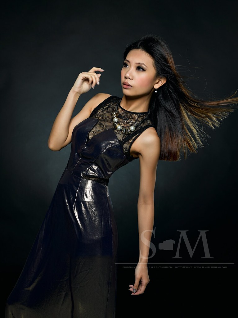
Do I even need to say what camera was used to shoot it?
