The right WB is many times subject to discussion. What is the definition of a right WB?
- The one that allows to see the real colour of objects?
- The one that reminds us better the feeling we had at taking the picture?
- The one that pleases most our eyes?
...
There could be 3 different WB settings for those 3 definitions. IMO
the right WB depends on the application. Just an example:
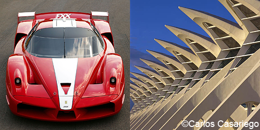
If you are so lucky to have Ferrari as a customer, they will demand a precise Ferrari red colour for their catalogue. The right WB here will be the one that provides the real colour of the Ferrarri. So using a custom WB over a neutral gray card will be
the right WB.
If we are taking more emotional pictures of a warm sunset over a white building, we don't want the building to look white (its real colour) in the final image, but preserve some of the warm atmosphere. In this case a gray card would ruin our WB, and we would obtain
the right WB by just tweaking it on the RAW developer to match the light and feelings we recall from the scene.
Two different ways to achieve
the right WB. None of them would have worked in both situations.
Regards
