Pages: [1]   Go Down

Author Topic: B&W Rose macro  (Read 1361 times)

sailronin

  • Sr. Member
  • ****
  • Offline Offline
  • Posts: 335
    • David Reams Photography
B&W Rose macro
« on: April 30, 2011, 06:14:18 pm »


HB 501CM w/150mm and 55mm extension tube on Kodak Portra 400VC converted with SilverEfx Pro
Logged
Thank you for looking, comments and critiques are always welcome.
Dave

http://sailronin.smugmug.com

wolfnowl

  • Sr. Member
  • ****
  • Offline Offline
  • Posts: 5824
    • M&M's Musings
Re: B&W Rose macro
« Reply #1 on: May 01, 2011, 01:41:27 am »

I think the rose shows great detail, but to me there are too many distracting background elements and not enough to separate them.

Mike.
Logged
If your mind is attuned t

sailronin

  • Sr. Member
  • ****
  • Offline Offline
  • Posts: 335
    • David Reams Photography
Re: B&W Rose macro
« Reply #2 on: May 01, 2011, 07:04:10 am »

Thank you Mike,
You're right, I tried a cropped version below and it looks much better.
Dave


Logged
Thank you for looking, comments and critiques are always welcome.
Dave

http://sailronin.smugmug.com

Jeremy Roussak

  • Administrator
  • Sr. Member
  • *****
  • Offline Offline
  • Posts: 8961
    • site
Re: B&W Rose macro
« Reply #3 on: May 01, 2011, 02:20:02 pm »

Thank you Mike,
You're right, I tried a cropped version below and it looks much better.
Dave


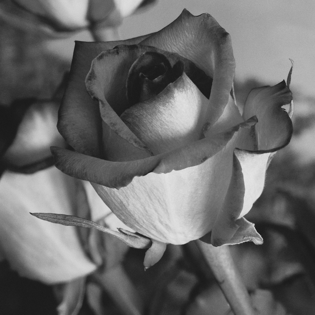
Yes, it helps a bit (although I can hear already Russ getting cross). However, the crop is uncomfortably tight at the top and the main distraction, which is the second rose to the left, is still very much present. It's a shame, since as Mike observed, the featured rose is very nicely shown.

Jeremy
Logged

MGH

  • Newbie
  • *
  • Offline Offline
  • Posts: 28
Re: B&W Rose macro
« Reply #4 on: May 02, 2011, 06:28:25 am »

Hi...I really like the rose but I´m with Mike the background is too distracting. Keep the rose as it is but try cloneing out the vertical stem on the right and then dodge and burn the background to lower the contrast between the distracting elements and then blur it some more. Also it´s a good photo to try adding some texture overlays.

  Mark
Logged
Pages: [1]   Go Up