Lui, thanks for taking the time to assist with this issue. I was hoping you would weigh in.
First, let me make clear that my purpose here is certainly not to disparage your software. I really like the sharpening that it performs on certain types of images, and I would like to use it longer term. My purpose in testing and posting about it is to also understand its limitations, whether they can be circumvented, and if not whether to use it anyway under appropriate circumstances.
I agree that
most colors in
most normal photographs will fall within the sRGB space. However in a substantial minority of cases, there will be colors that fall outside sRGB but that are within Prophoto or Adobe RGB as well as, most importantly, within the gamut of many printers. Saturated green leaves, intense fall colors, and many flowers, for example. Usually we want to preserve those colors as much as possible. If that were not the case, there would be little reason for anyone to use a working color space other than sRGB; but many knowledgeable photographers justifiably do use wider gamut Prophoto or aRGB.
The color ramp tif (not raw) file that I used in my initial example is well suited to illustrate the point that I was making, which is that piccure+ version 3 changes colors in a way that mimics a simple conversion from a wide space to sRGB. Since that color ramp contains many colors outside of sRGB, converting to sRGB gives a unique and easily identifiable pattern when viewed on a wide gamut monitor. In my hands, processing with piccure+ v3 gives a visually identical pattern of changes. So if piccure+ v3 is not converting tifs to sRGB during its save process, it is doing a remarkably good job of imitating the color changes associated with that conversion.
Further, my experience is not consistent with your statement that "if you start out with a ProPhoto color space (TIF) - it will remain ProPhoto. sRGB remains sRGB and AdobeRGB remains AdobeRGB." It is true that the reported color space
tag in the metadata remains unchanged; but the actual colors transform to exactly match what you would see by a normal conversion to sRGB. As I noted in my posts above, I have confirmed this on real world photographs (which is where I first noticed it), not just on artificially generated color ramps. The processed image may technically still be in Prophoto or aRGB space, but the colors within it look like sRGB, which is what really matters.
To demonstrate this with an image I don't think anyone can argue with, lets look at another example using a portion of a tif (not raw) file image prepared by well known photographer Bill Atkinson, and widely used by many photographers to monitor color management and the output of their printers. I'm inserting a jpeg image in sRGB space within this post, so that everyone can see and recognize the image I'm referring to.
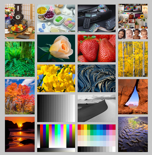
I'm also attaching to the bottom of this post a larger tif (again, not raw) file of this image in the Prophoto color space (Atkinson Test Page_Prophoto.tif). Due to file attachment size limitations, I will attach to a subsequent post two other versions of this image. One of them started with the Prophoto image and was converted to sRGB in Photoshop (file Atkinson Test Page_sRGB.tif). The other one also started with the Prophoto image, but instead of converting it, it was processed with the piccure+ v.3 PS plugin at default settings and saved (Atkinson Test Page_Prophoto_piccure.tif).
Examination of the files in Photoshop on a wide gamut monitor shows that in the file converted to sRGB, several of the sub-images in the file show altered colors: the green foliage of the forest on the left side, the orange fall foliage below it, the yellow flowers in row 3 of the second column, and the yellow foliage of the forest in the far right column are all changed (for the worse) in hue compared to the original Prophoto version. As of course are the color ramps at the bottom. The Prophoto file that was processed with piccure+ and saved shows identical color changes, while nevertheless retaining a Prophoto color tag in the metadata.
I welcome anyone with a wide gamut monitor to download these 3 files and compare them in a color-managed program like Photoshop. And if you are also willing to take the original Prophoto file and process it with piccure+ v.3, you can see for yourself whether the color changes as I have described.
Again, I'm not trying to knock piccure+ or discourage anyone from using it. Even if the behavior I describe here is intrinsic to the method it employs, and can't be changed, I may still use it for images where color changes don't occur (which is most of them). But I do think that if what I describe is accurate, then it should be clearly stated in the description of the product, so that users don't discover an unpleasant surprise after they have purchased it. That can't be good for anyone on either side of the transaction.
And if I'm just all wrong about this, please demonstrate it and I will happily recant my concerns. I would like to be wrong.
